Abstraction
Abstraction is a type of photography with absolutely no rules abstraction is defined as "something theoretically or separately to something else". Something abstract is a representation of real life. An abstract photo is a picture with no obvious subject/focus, instead it may focus on shape or colours instead of a recognisable object. The formal elements are the parts that are used to make up a particular piece of artwork, generally used when creating abstract images because they create more for photographers to focus their work on. They consist of: line, shape, form, texture, tone, colour and composition. The abstract elements however are slightly different; they focus solely on the features that should be used in an abstract piece of photography or art. These consist of: focus, light, line, repetition, shape, space, texture and value/tone.
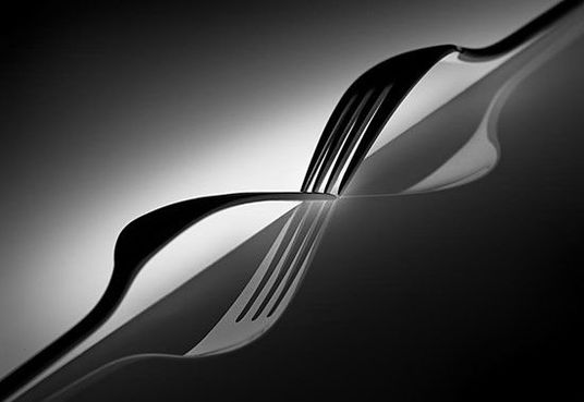
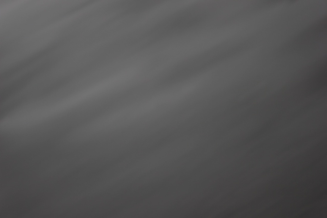
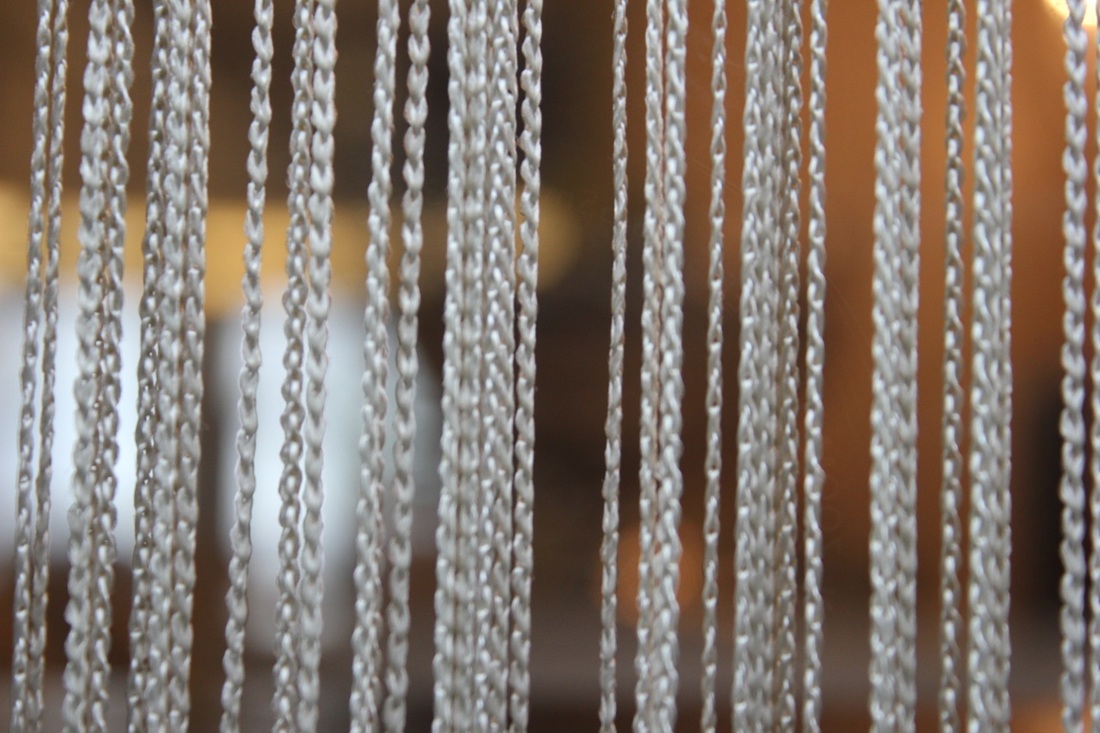
Focus: The whole of the image is in focus, making it look sharper overall and more interesting.
Light: The photo is backlit, there is a sharp contrast between the shade and light. Despite of this though, the light in the image gets progressively lighter as the image comes down (from the top left corner).
Line and shape: The two forks make a continuous sweeping curve in the shape of the infinity sign, perhaps suggesting to the viewers that the image just keeps on going.
Repetition: The forks mirror each other, making a sort of repeat reflection.
Space: There are two dark corners, where there is nothing but the rest of the space is used up but this is effective because it creates more of a focus on the main subject of the image which is the two forks and their reflections.
Texture: Mostly everything seems hard but not harsh making the image seem sharp and unforgiving. However, the dark tones in the top left corner to me seem quite soft in texture, despite the bold, dark colours.
Value/Tones: The image is in black and white, with all tones of grey in-between, the grey blends together to make the stark differences.
Pierre Cordier
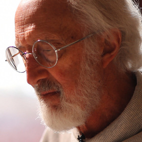
Pierre Cordier was born on January 28th 1933 in Belgium, Brussels and is a Belgian artist, known as the father of the chemigram. He first started making chemigrams in 1956, He began accidentally when he used nail varnish to write a letter on photographic paper the technique that: "combines the physics of painting (varnish, oil, wax) and the chemistry of photography (photosensitive emulsion, developer and fixer), without the use of a camera or enlarger, and in full light". He started using different substances and went on to lead and extremely successful career, with many exhibitions at prominent galleries.
Beside is an example of one of his chemigrams. |
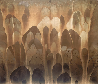
I really like this image because even though it is a chemigram, it can also be mistaken for a painting which shows exactly how precise his chemigram is. He hasn't got any stray lines flowing off the page; everything is exactly how I presume Pierre Cordier wanted his final chemigram to look.
|
My chemigrams
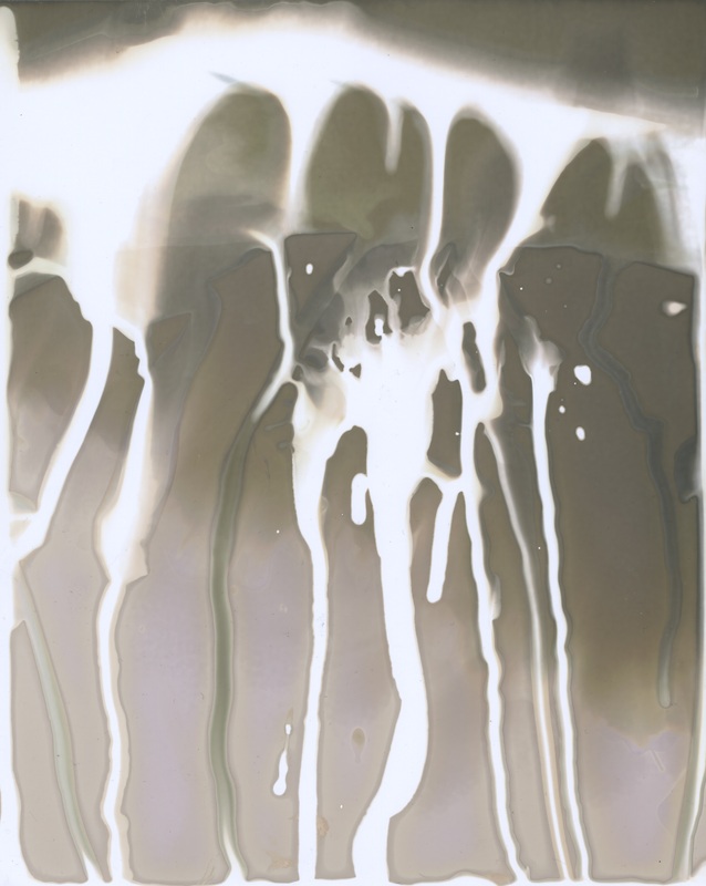
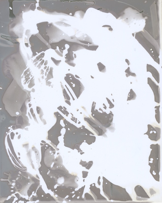
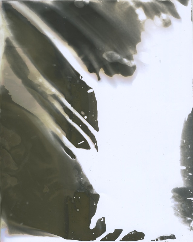
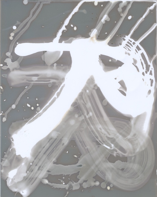
Here are the four chemigrams that I created in class. I experimented with each of the chemicals each time to see what kind of affect they would create after putting them in the light. In all of them, I have made it so that there is generally a clear contrast between the light and the dark to make a better effect overall. I tried sometimes using the paintbrush to get the print that I wanted more accurately, for example in my last chemigram where I used the paintbrush to draw out the letter 'R' with each of the three chemicals, creating a sort of shadowed effect. In my first chemigram, I used the paintbrush also, but to splash the chemicals onto the photographic paper. I then picked it up and tilted it downwards to make the liquid run down the page. For the third chemigram, I dipped the paper into the trays of the chemicals in order to see what kind of effect it would make after I had taken it out of the light.
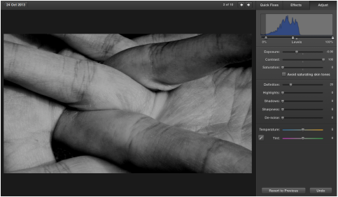
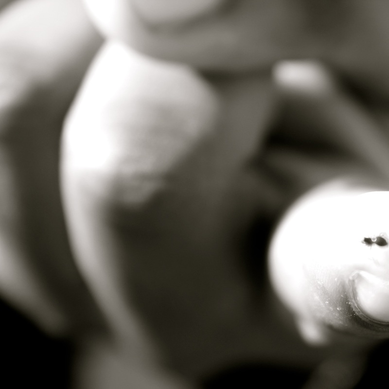
My Focus
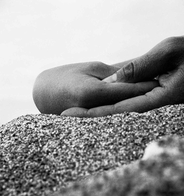
I am interested in creating a series of abstract images to do with bodily features that aren't immediately obvious as to what they are. I am interested in this type of abstract photography because when researching, I have found that it is quite intriguing to try and figure out what kind of body part is being featured. I am going to be researching the work of John Coplans and Bill Brandt.
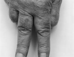
John Coplans
|
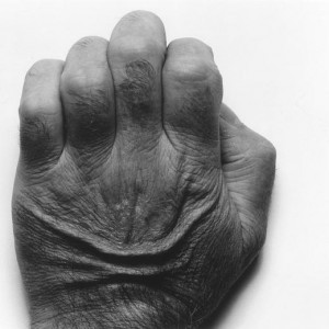
John Coplans - born June 24th 1920 - was a British artist who died in August 2003. He is most commonly known for his black and white mainly nude self portraits which showcased the aging body. He never photographed his face as his artwork was not based on identity.
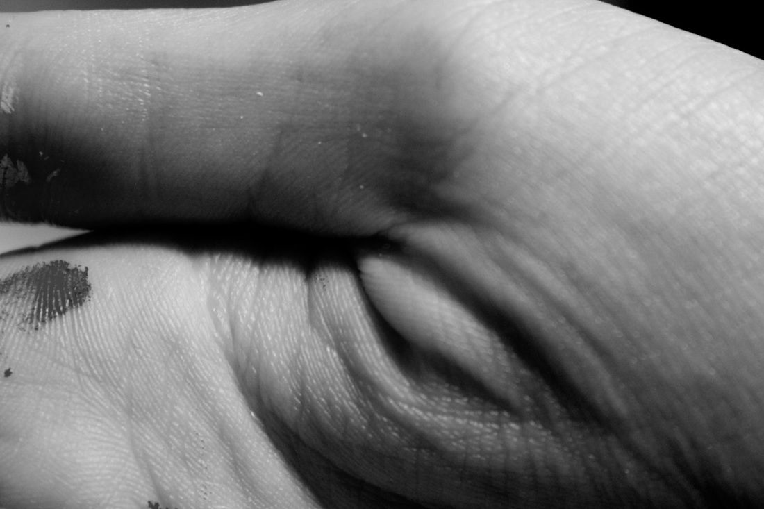
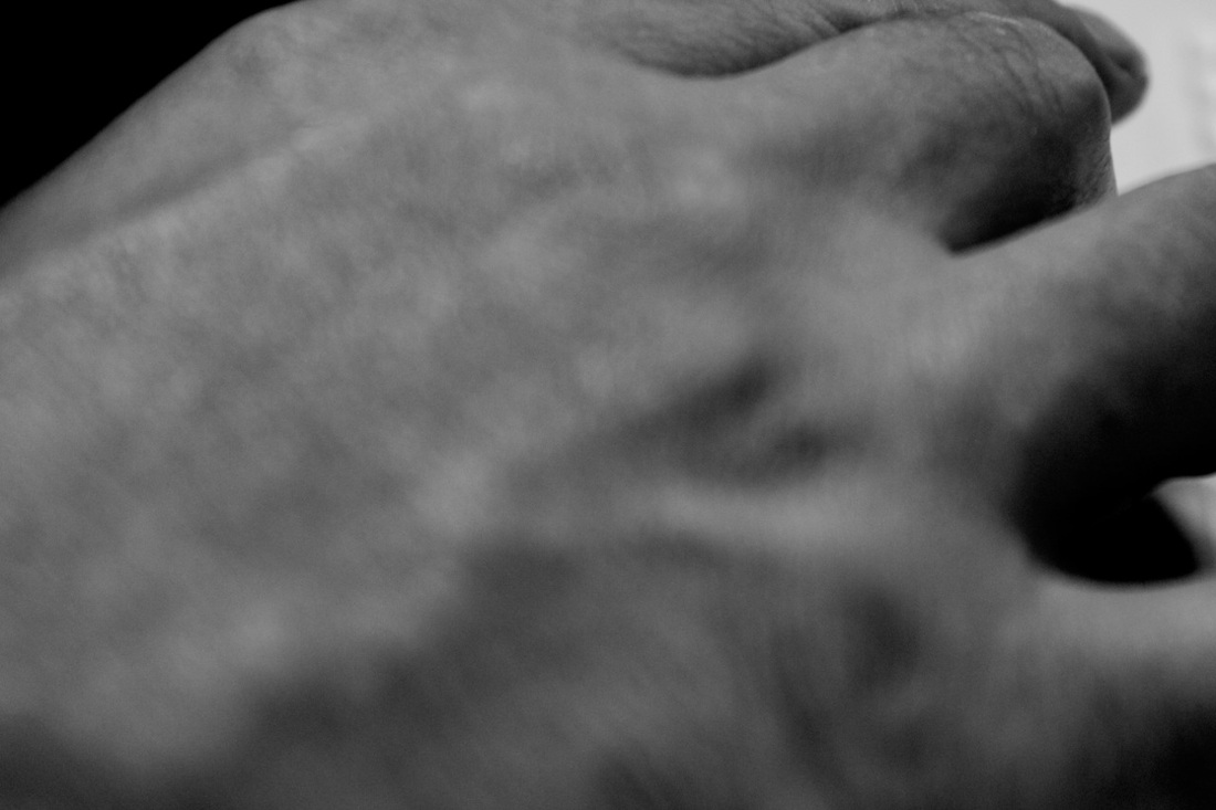
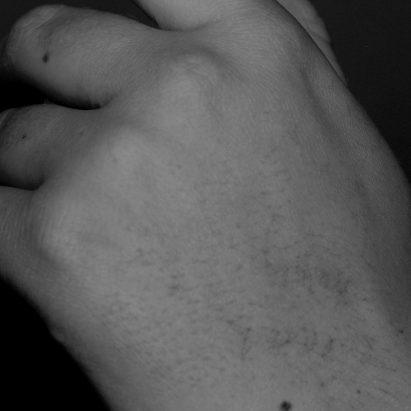
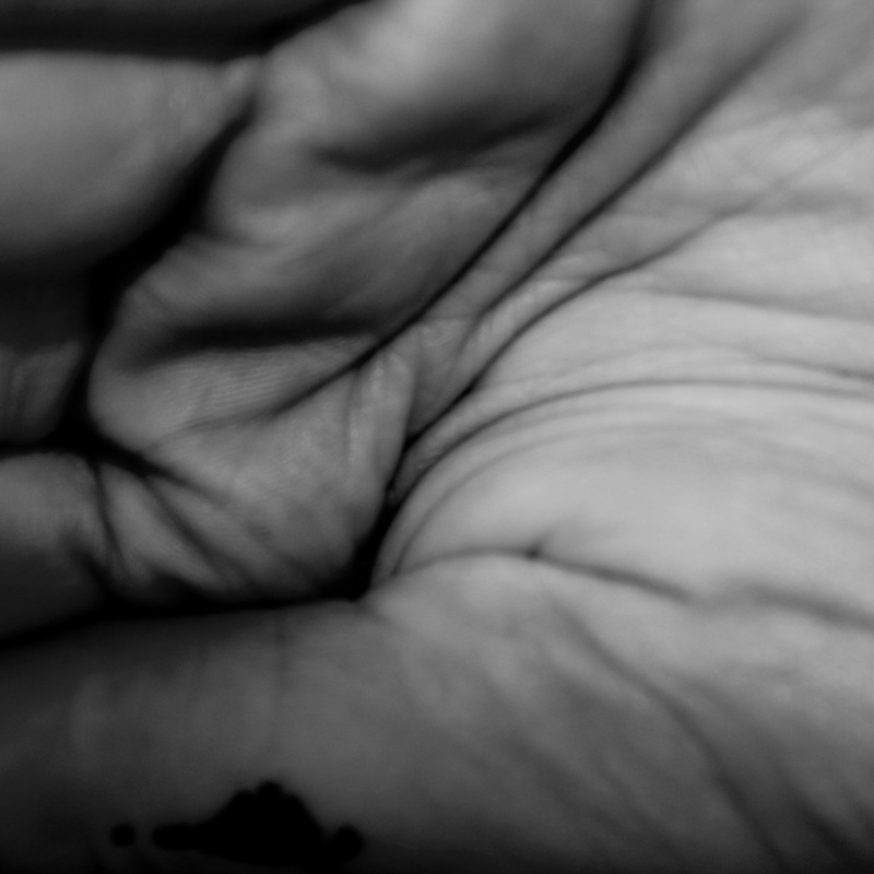
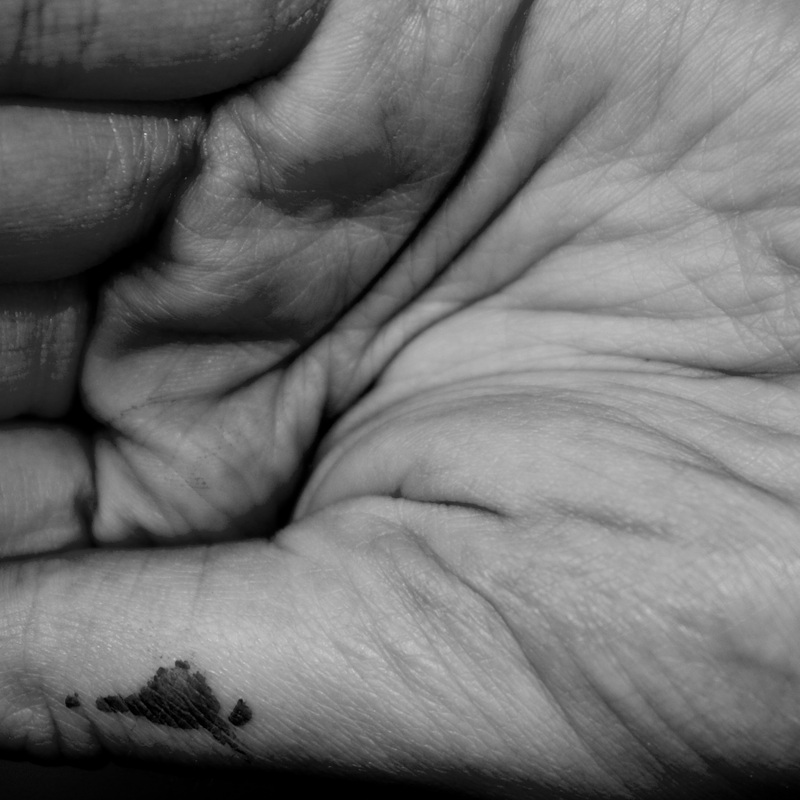
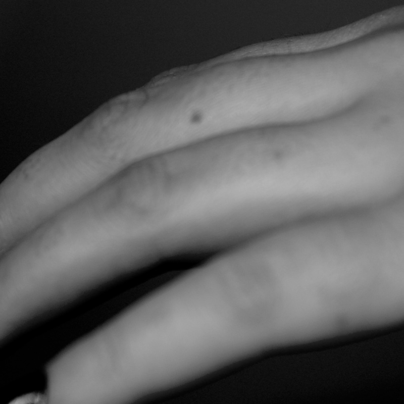
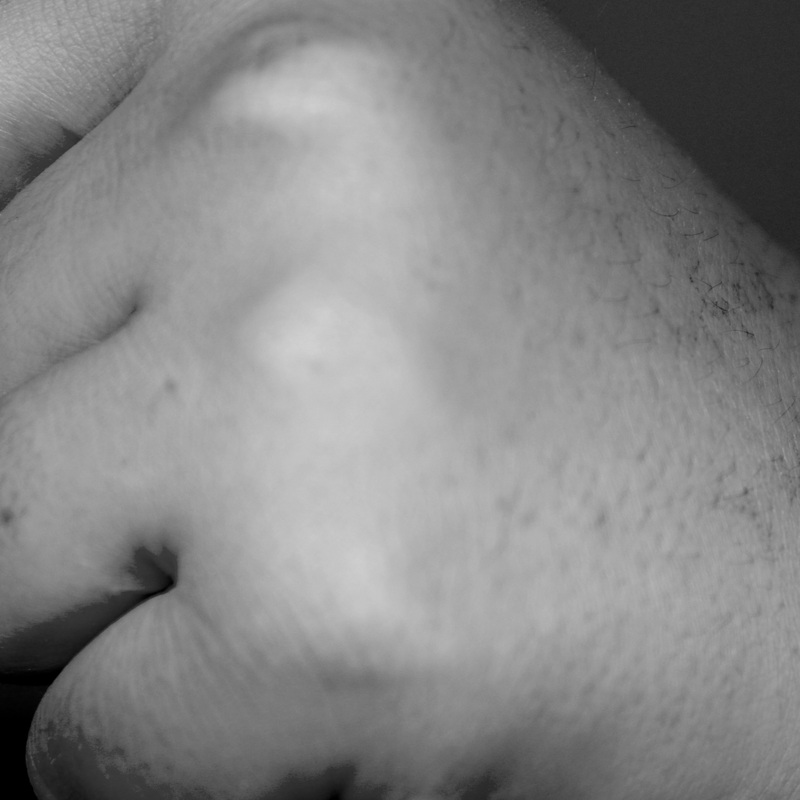
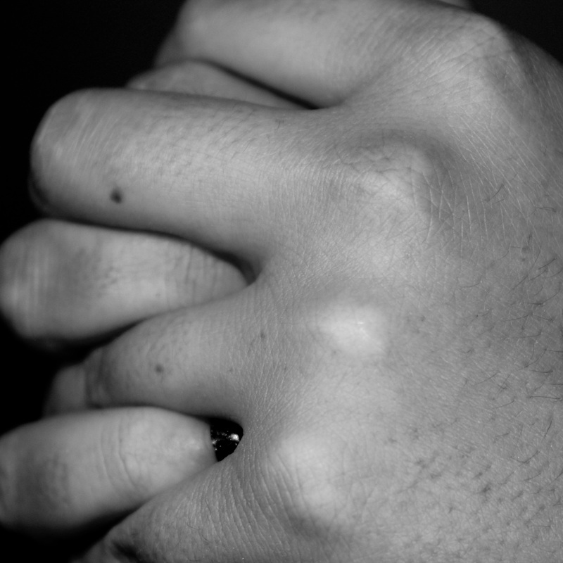
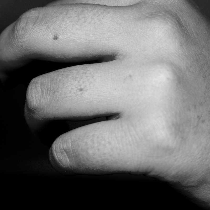
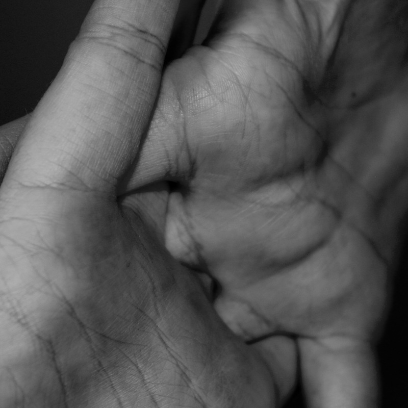
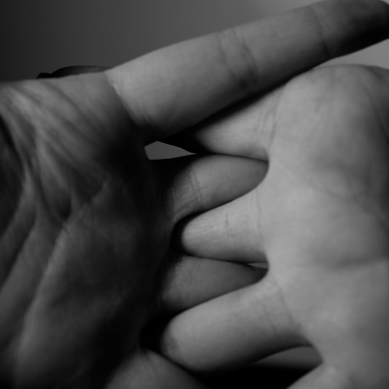
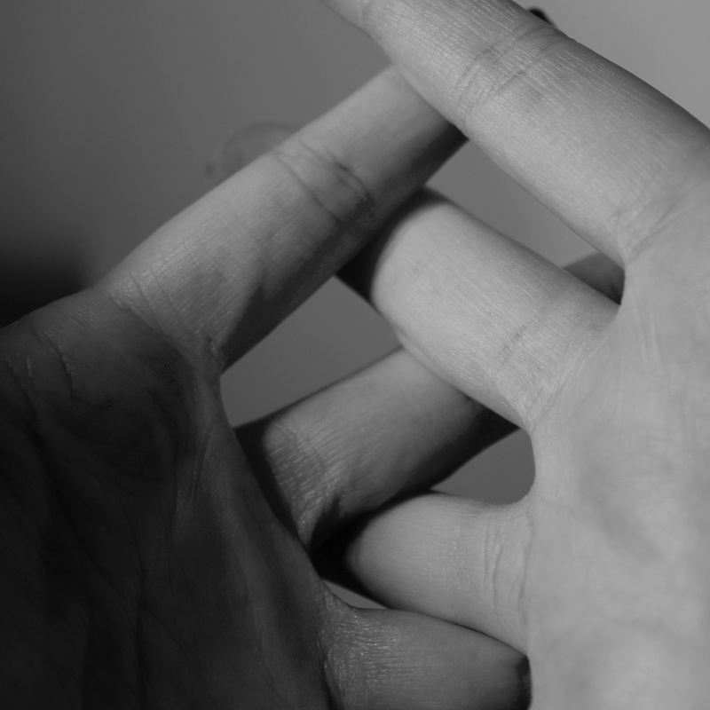
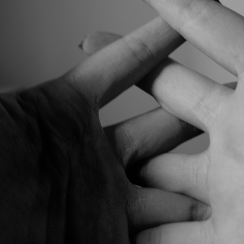
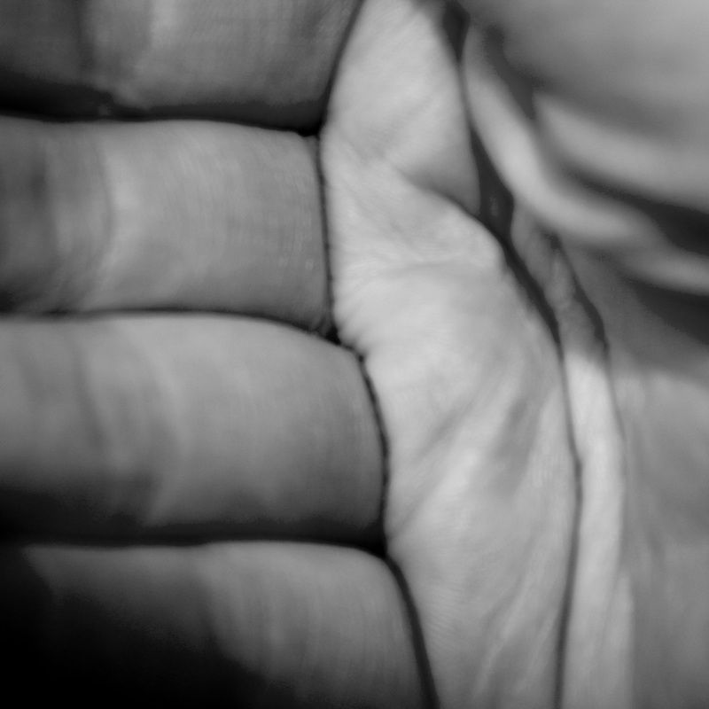
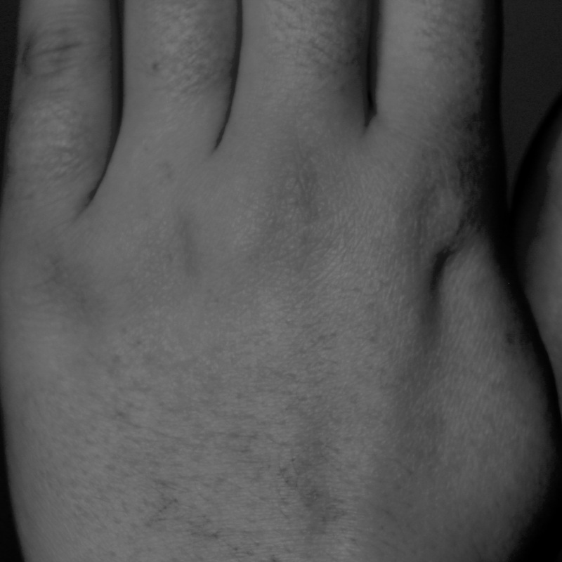
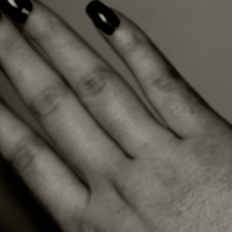
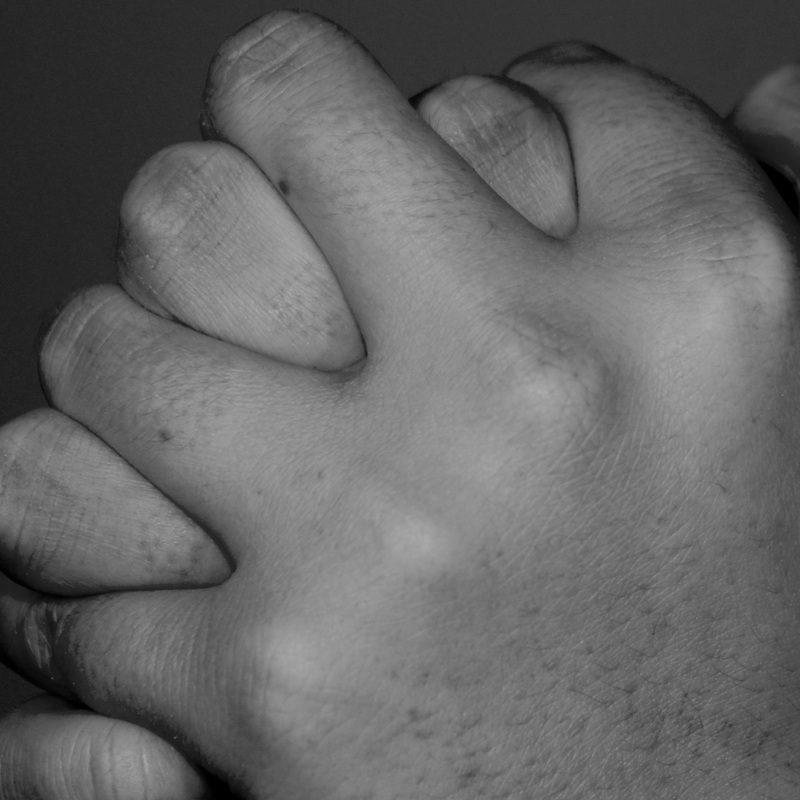
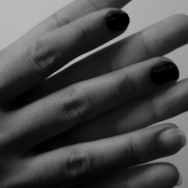
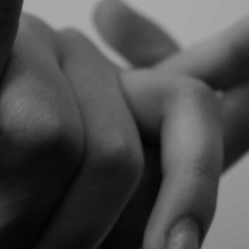
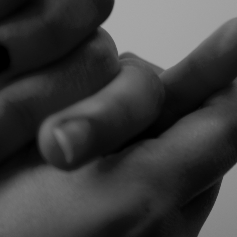
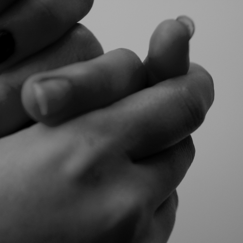
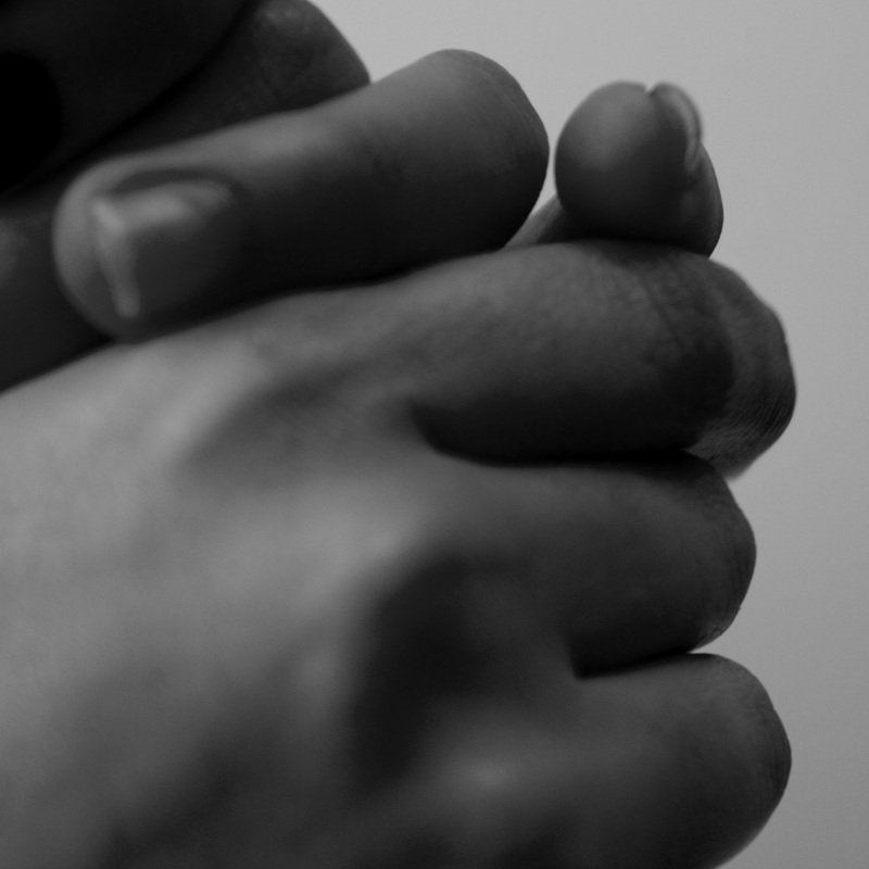
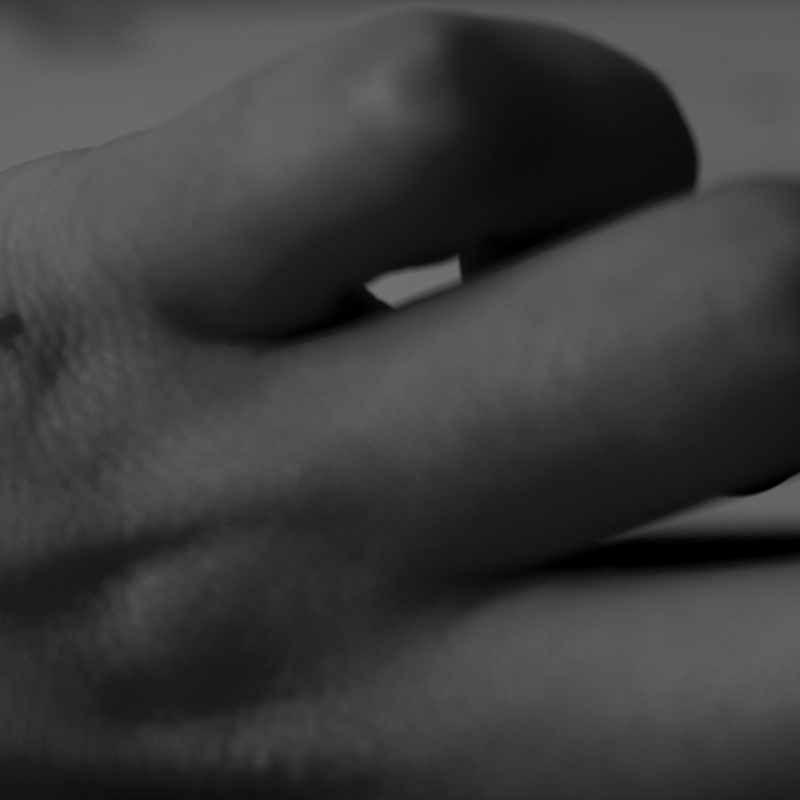
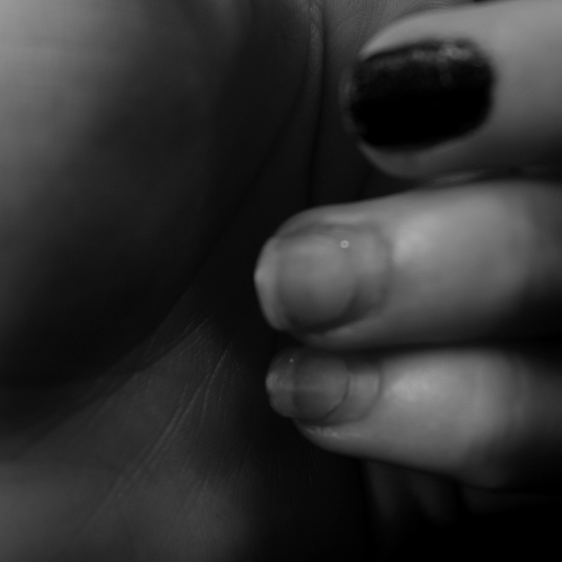
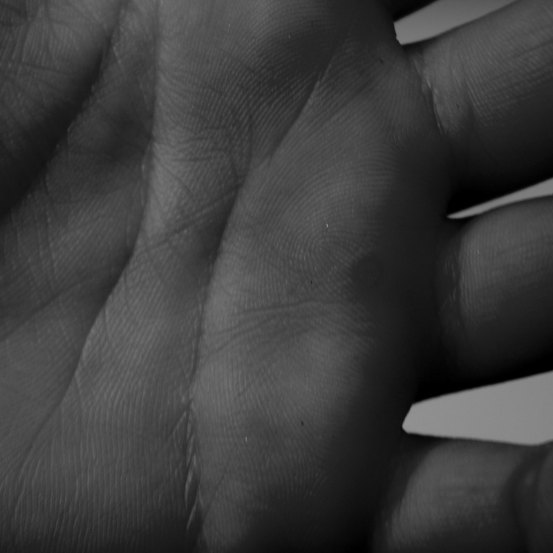
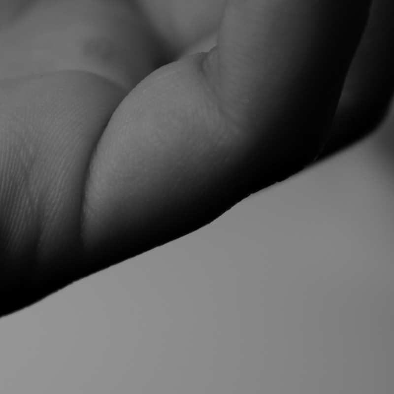
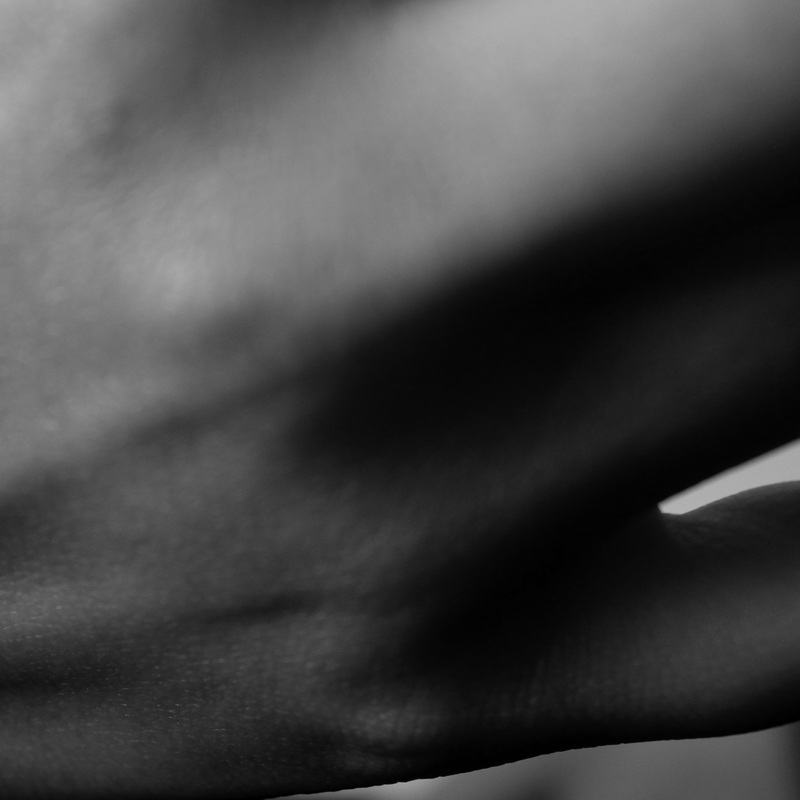
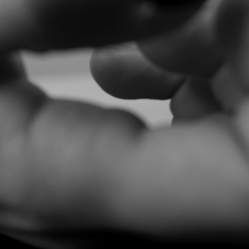
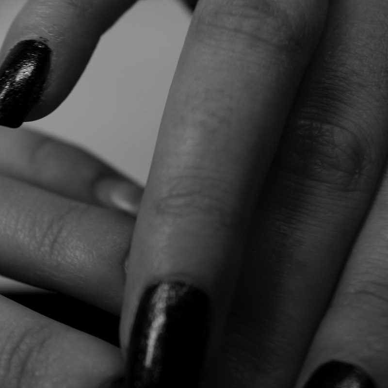
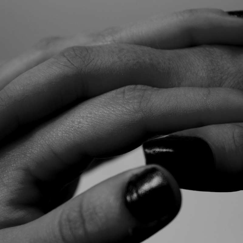
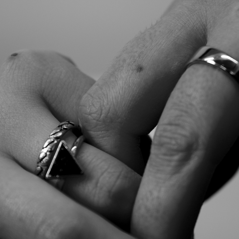
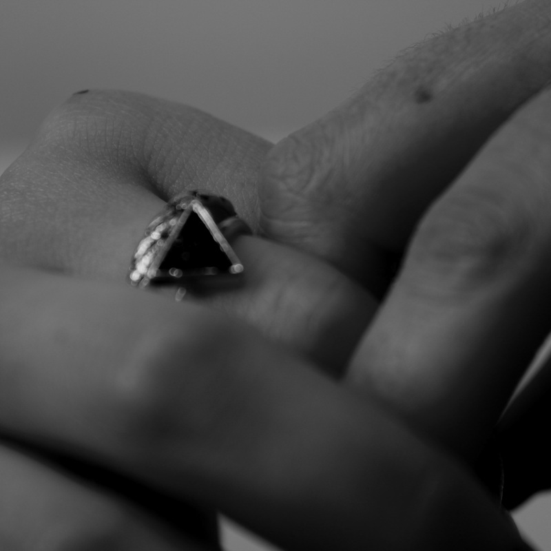
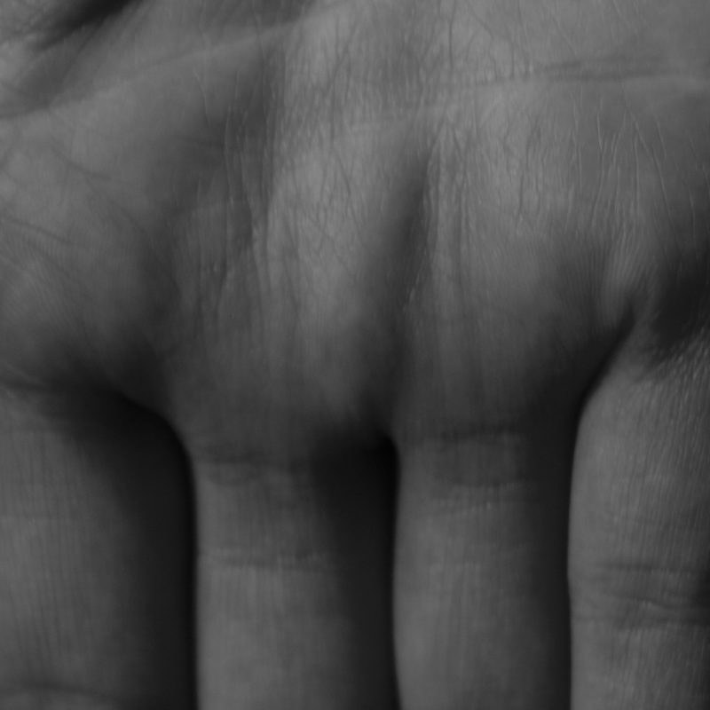
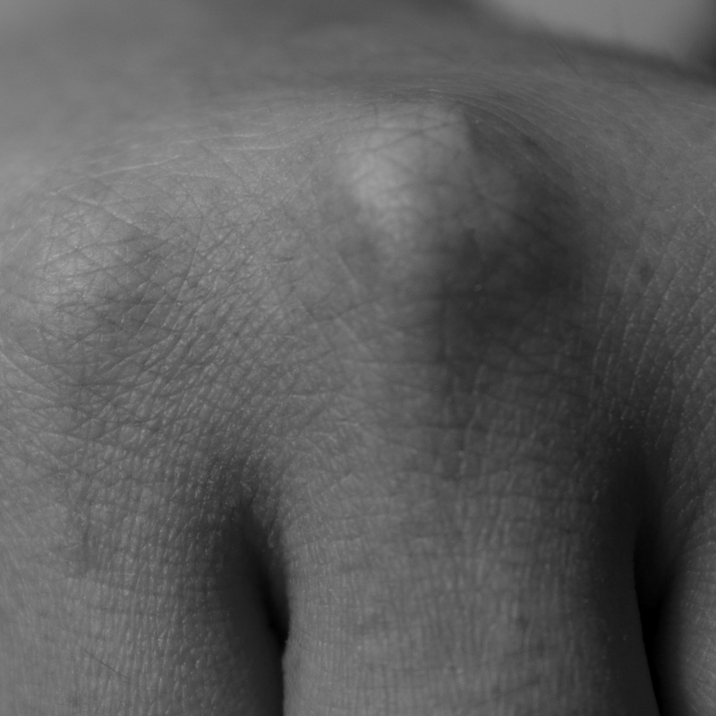
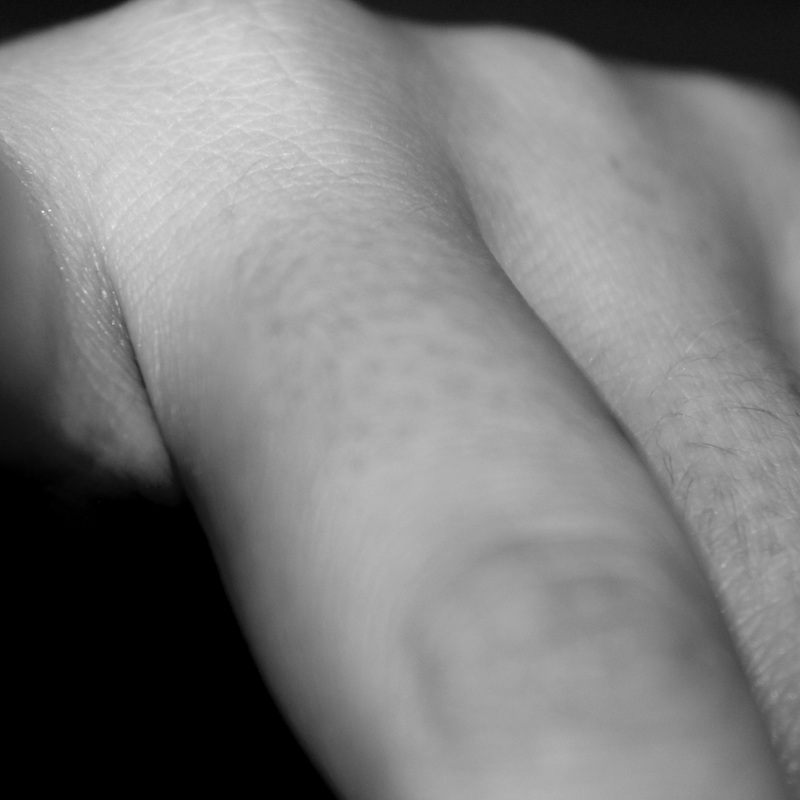
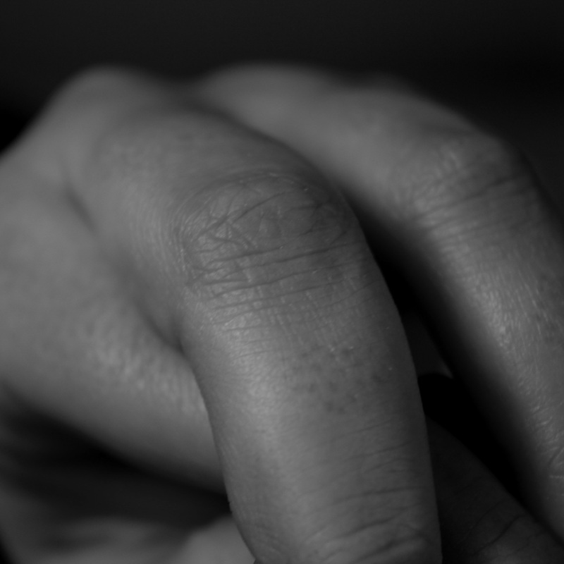
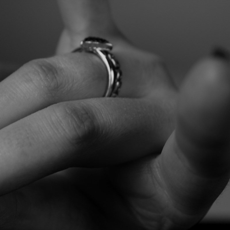
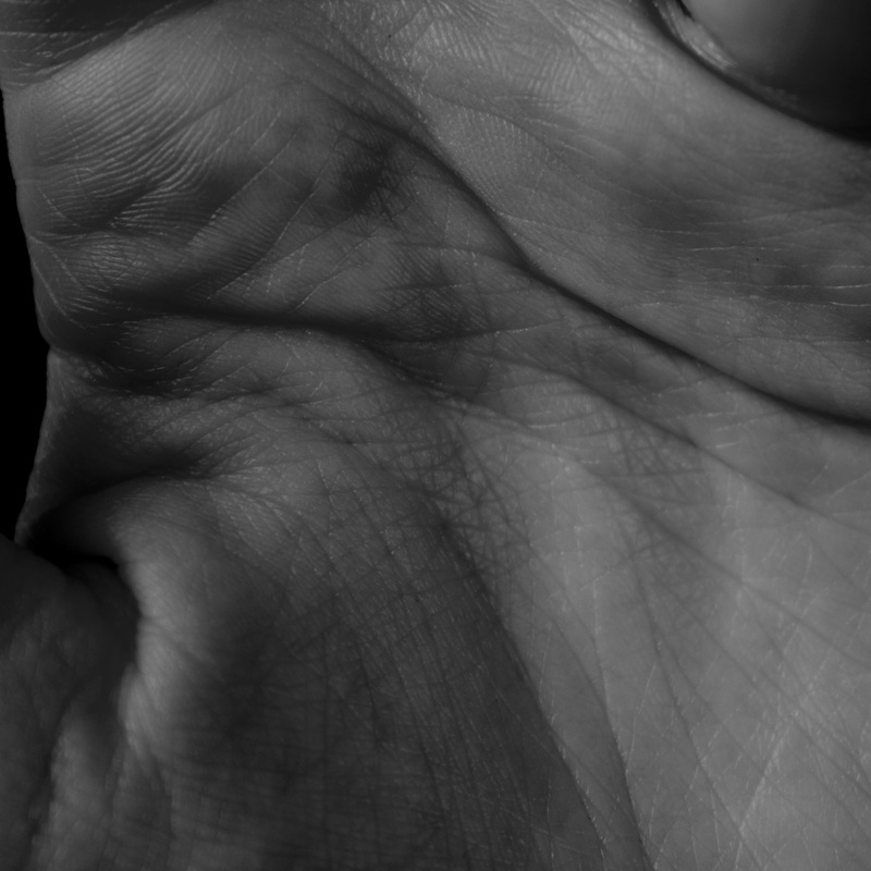
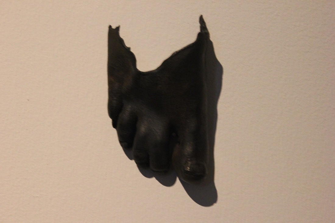
I thought that his work would suit my focus quite well because his images are quite abstract in a way that even though we know what they are, they are still very unusual and not what you would expect to see in any other regular photograph. Although John Coplans focuses on the whole body (minus the face), I chose to only showcase the images of hands on my website because I think this is where I would like to start with my abstract images. I think I am going to take some images on hands but more close up so that not the whole hand is shown, and then edit them in a way that is quite similar to that of e work of John Coplans. |
|
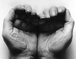
Bill Brandt
|
|
Bill Brandt (born May 2nd 1904) was a German-British photographer and photojournalist who died on the 20th of December, 1983. He is well known for his "high-contrast images of British society, his distorted nudes and landscapes, and is widely considered to be one of the most important British photographers of the 20th century".
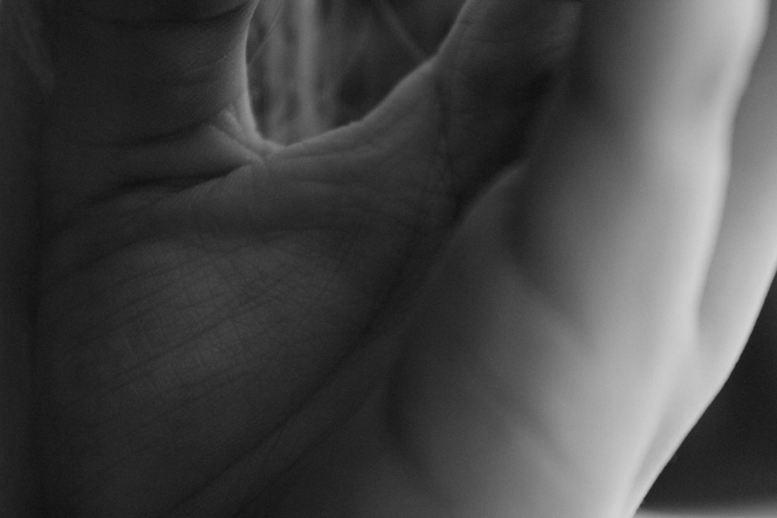
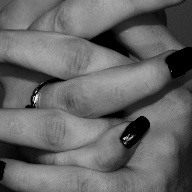
His work is quite similar to that of John Coplans but is also very different in its own way. He also focuses on nudes but because of important social commentary and poetic resonance. Once again I took only the images of hands to showcase on my site because these are the ones that I think will give me the most inspiration for the set of images I am going to take. I like how he not only uses light backgrounds for his images but also dark. I think that this is different to John Coplans' hand images but in a good way and I think it is a good idea to possibly incorporate into my own set of images. |
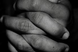
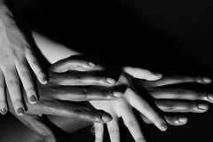
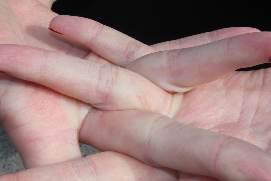
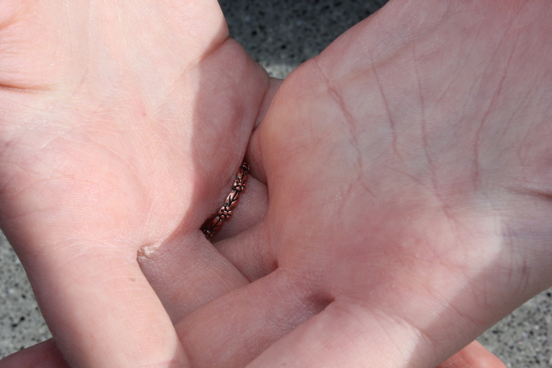
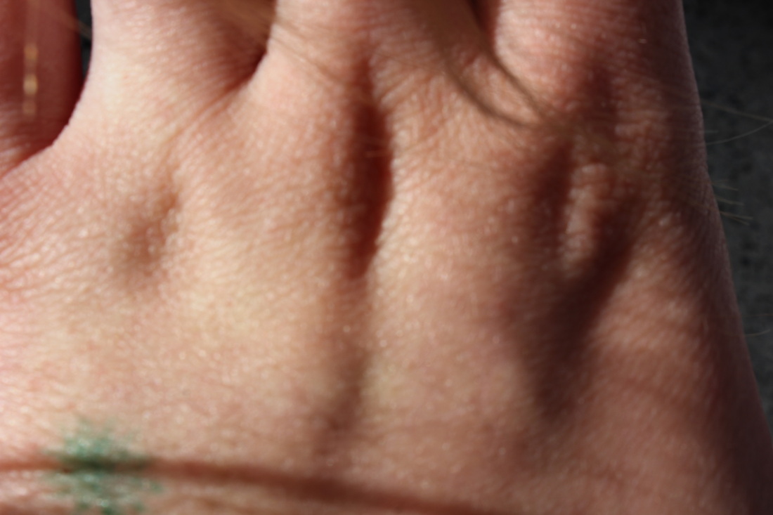
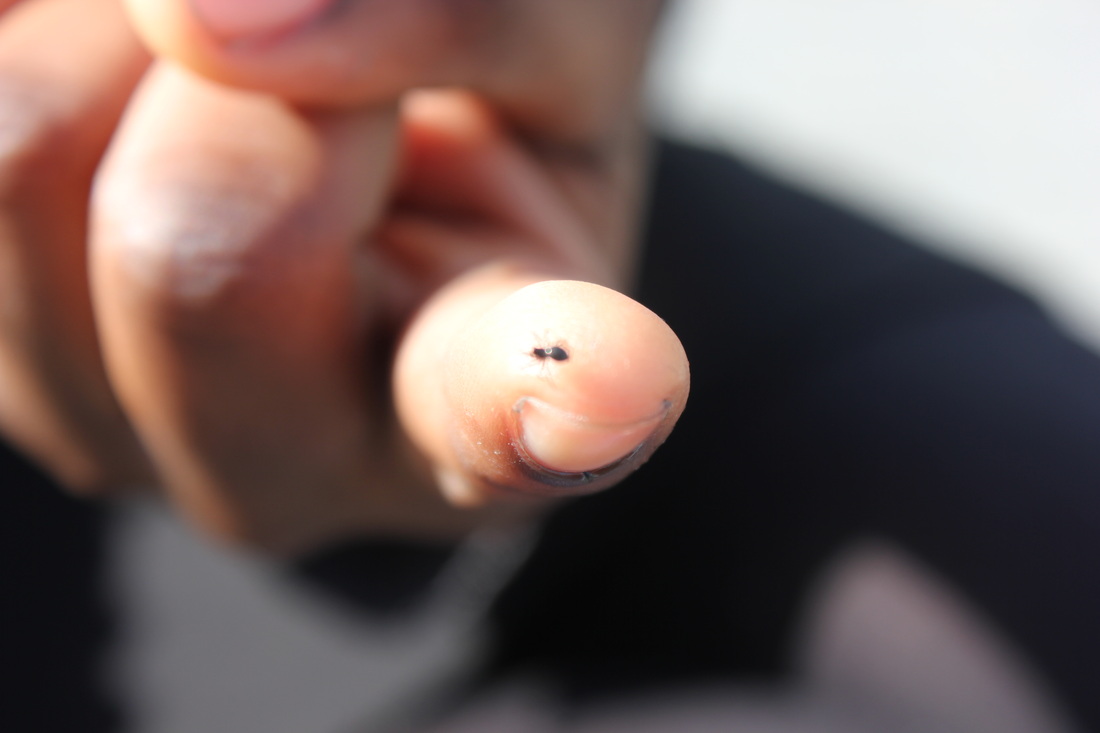
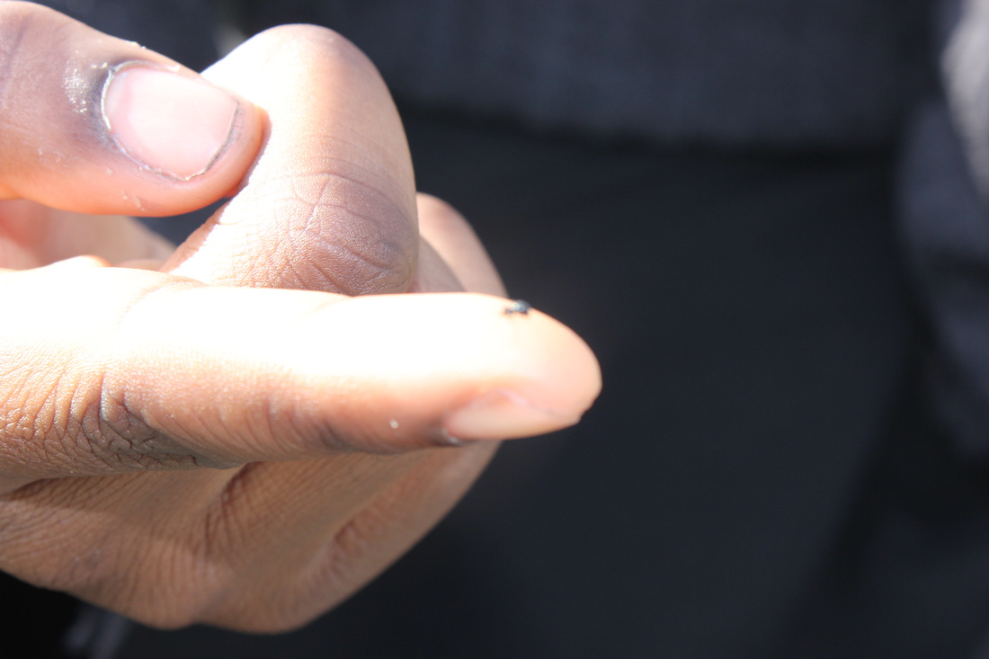
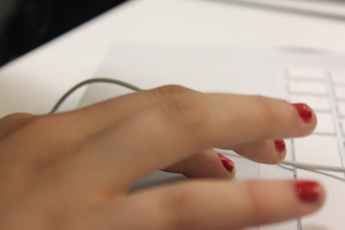
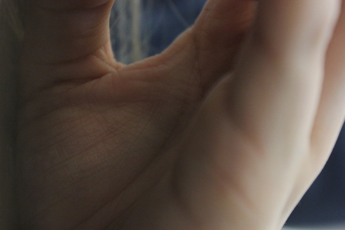
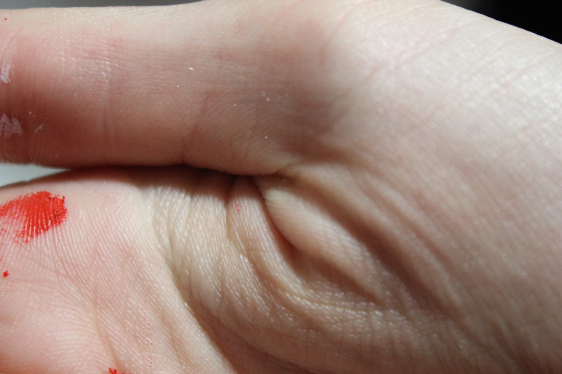
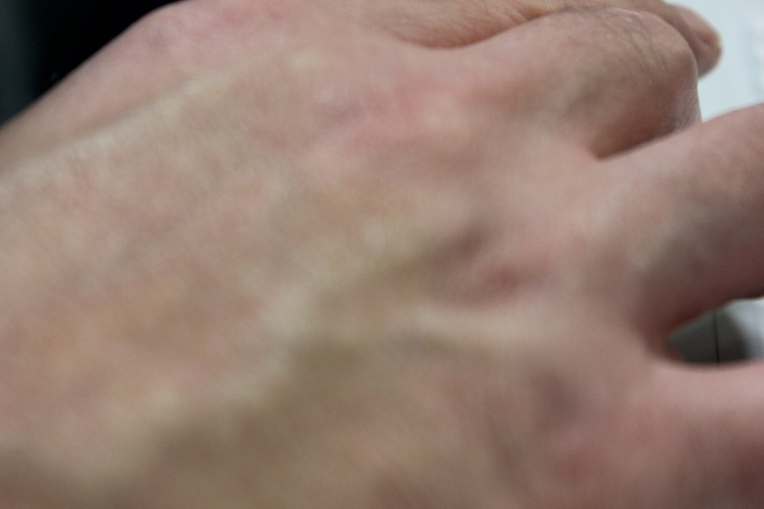
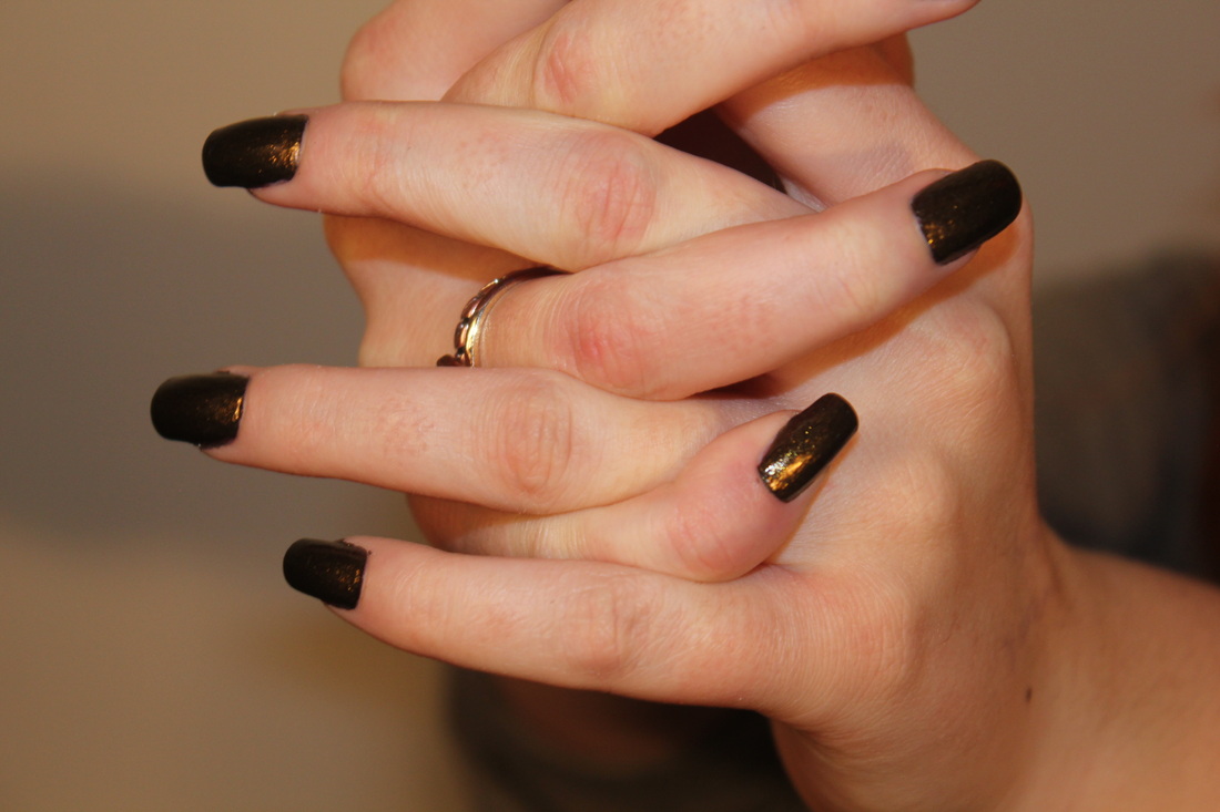

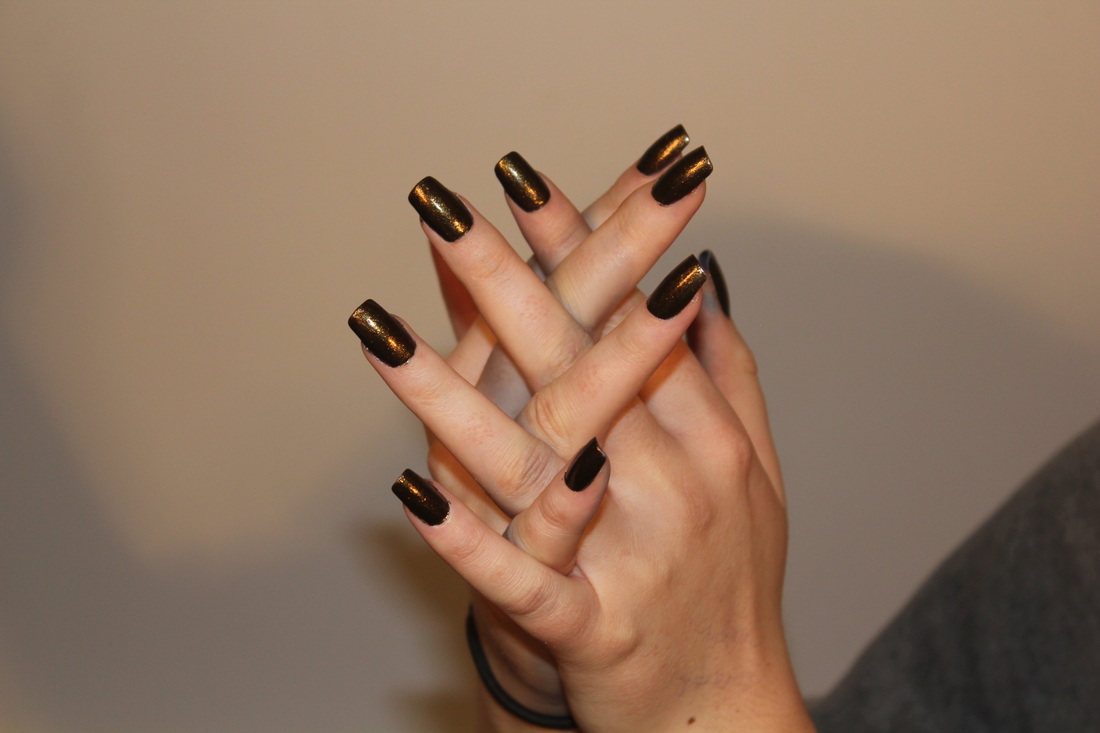
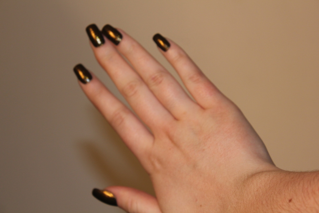
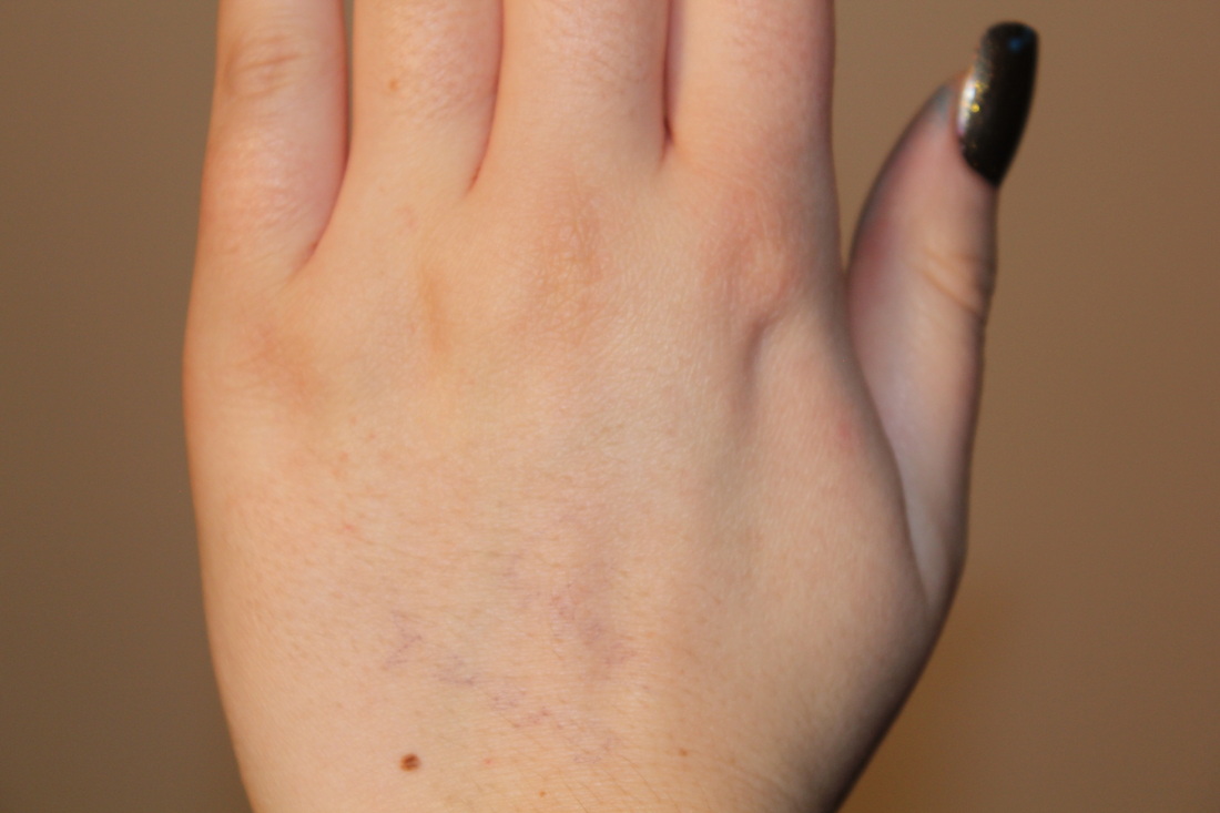
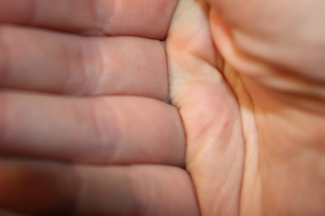
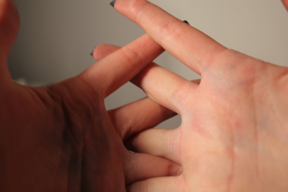
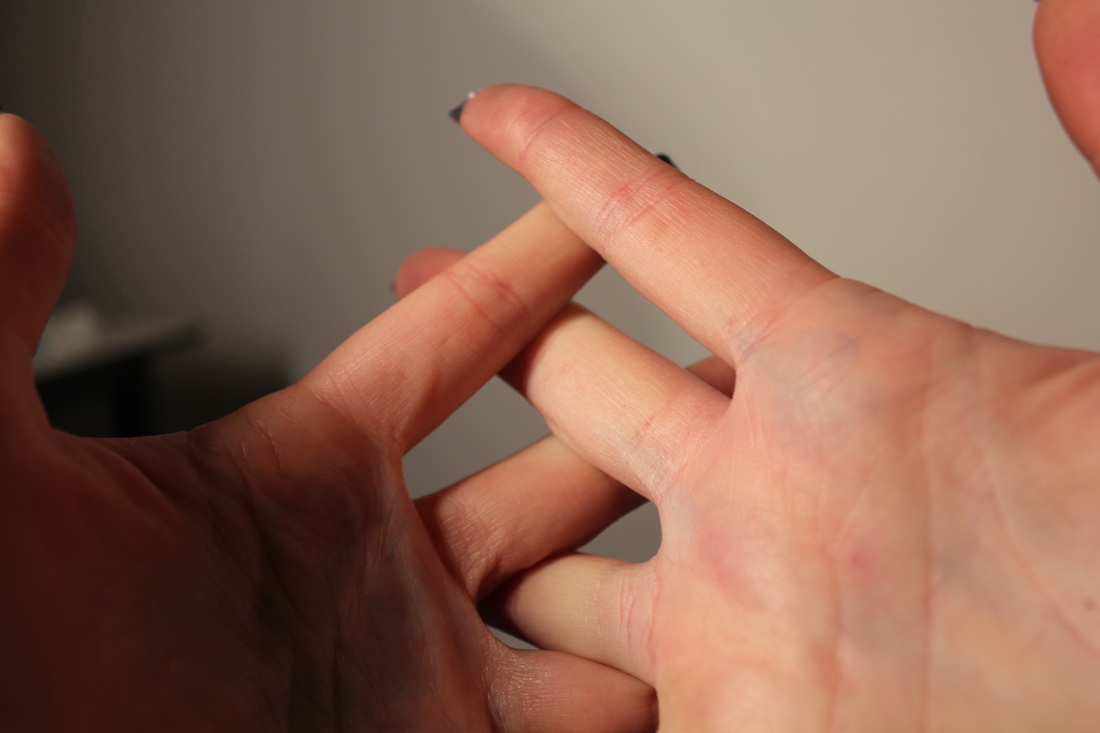
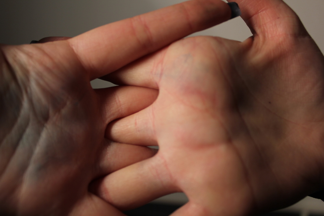
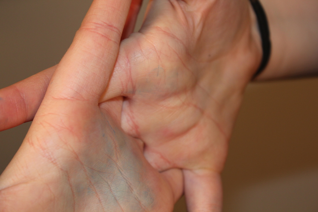
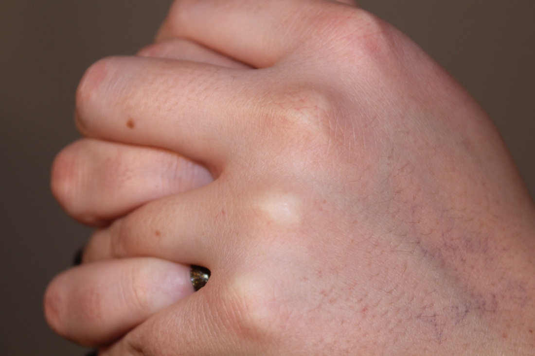
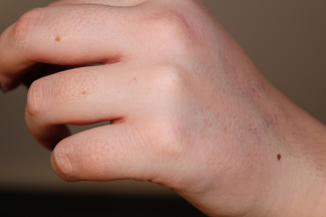
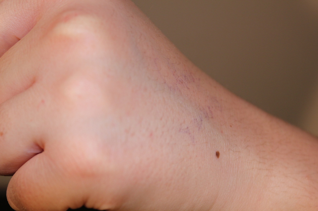
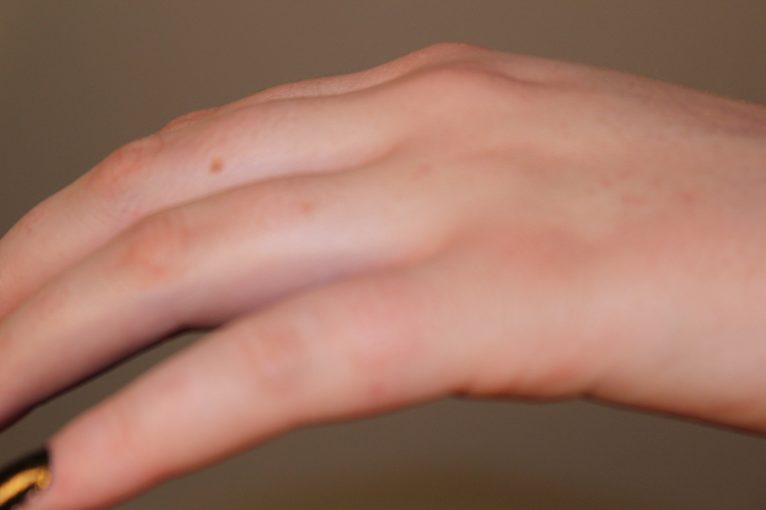
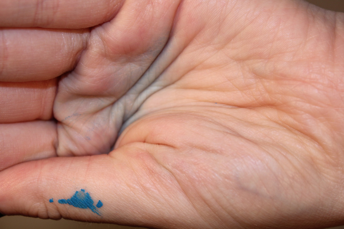
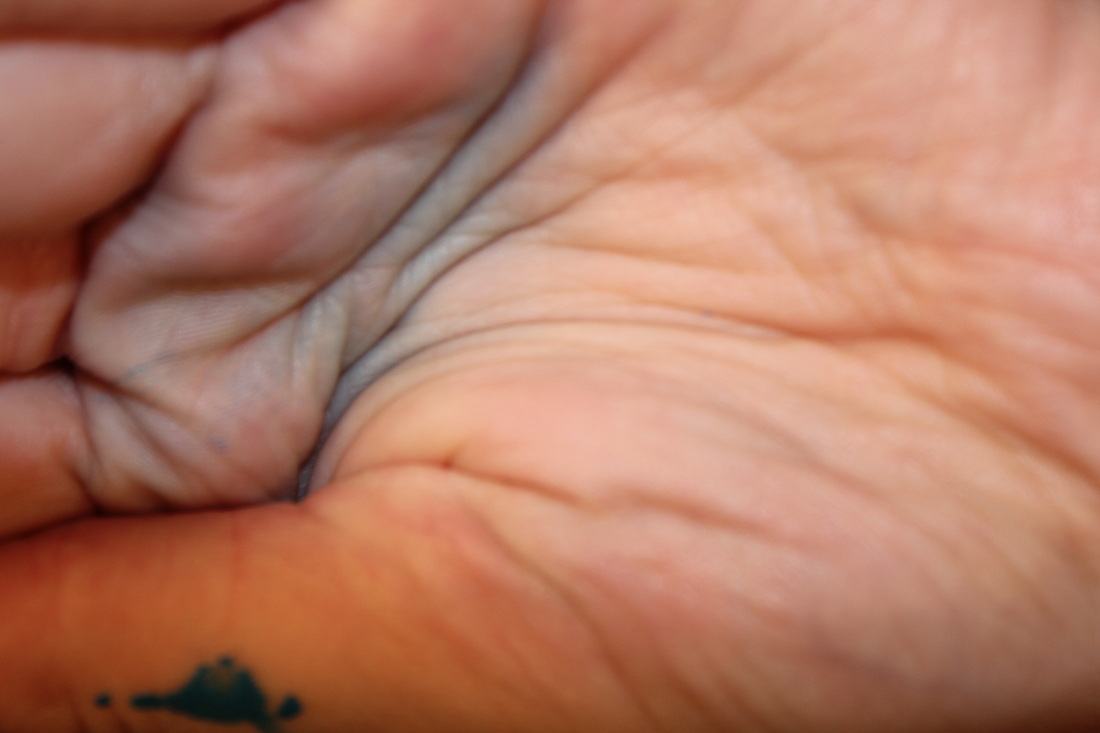
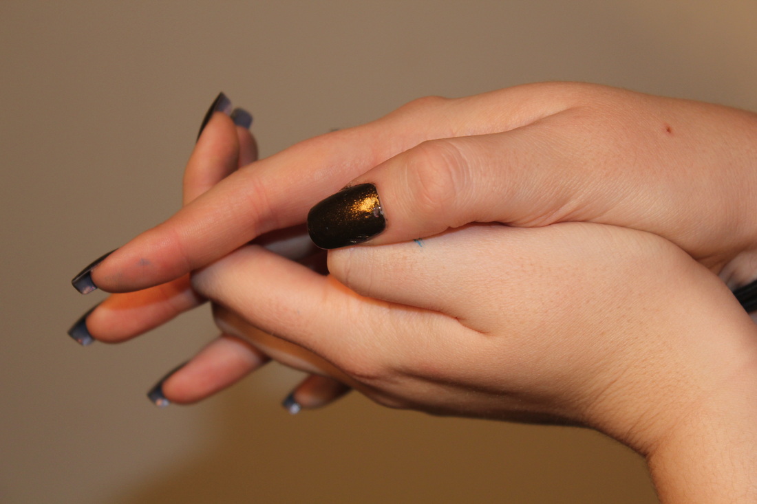
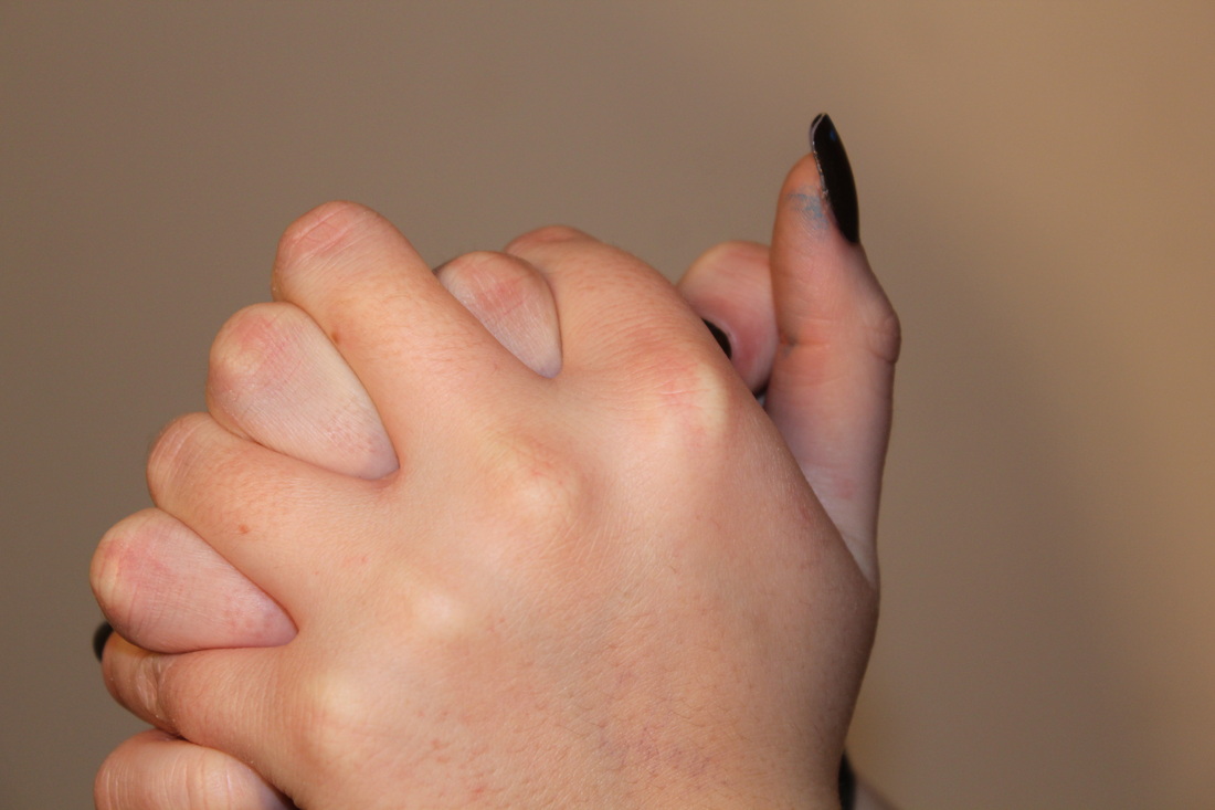
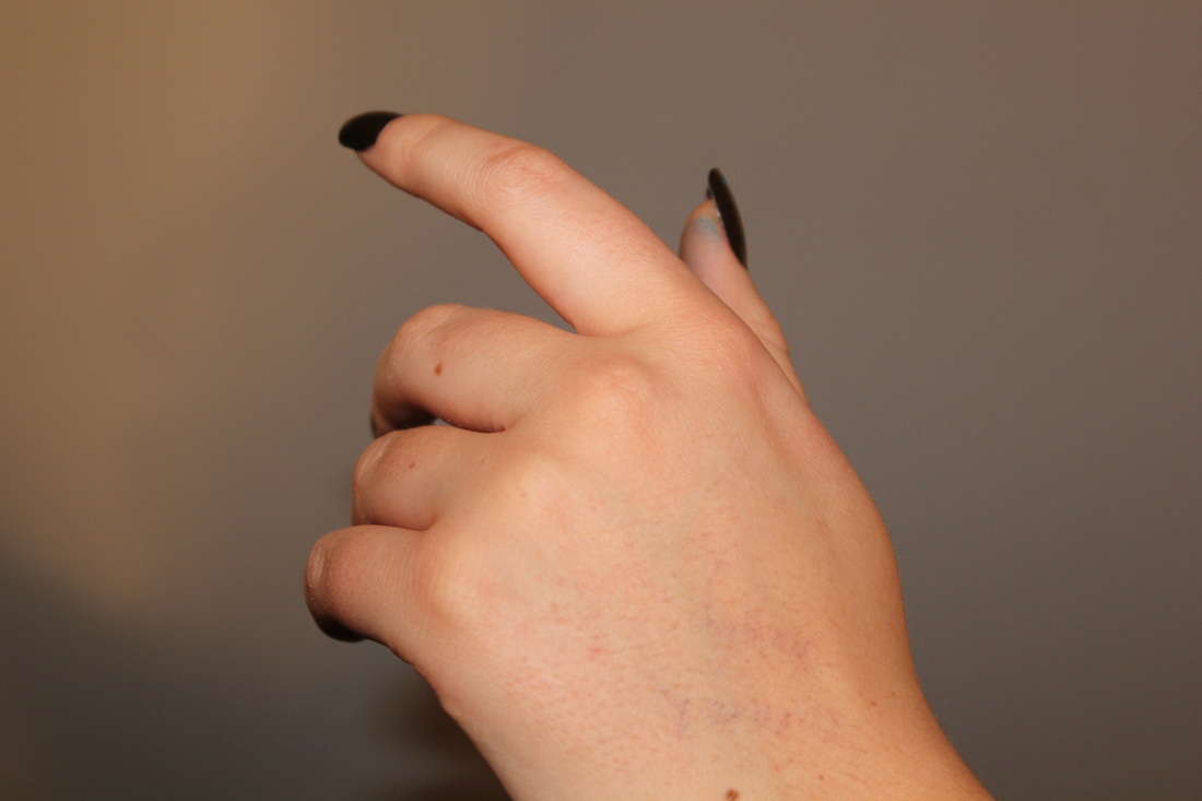
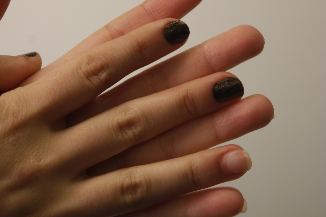
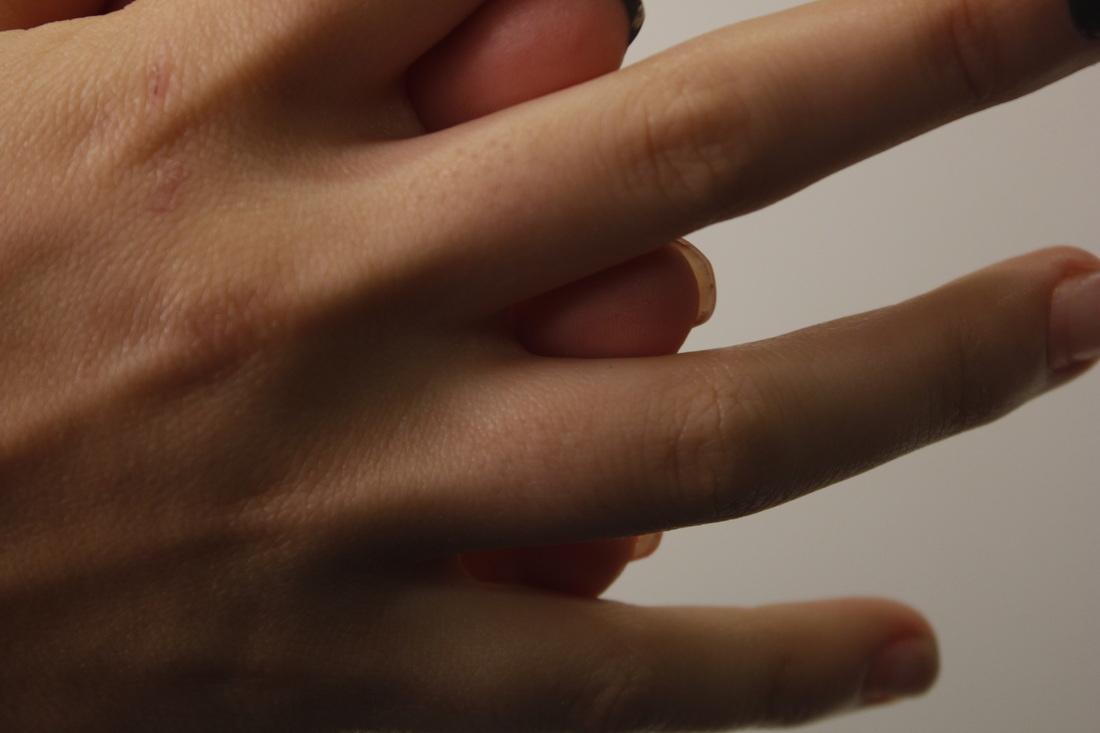
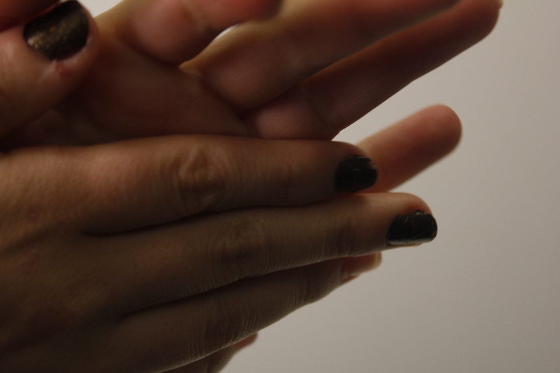
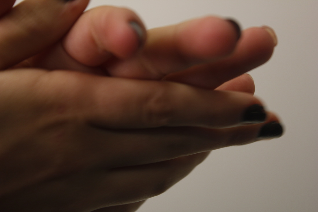
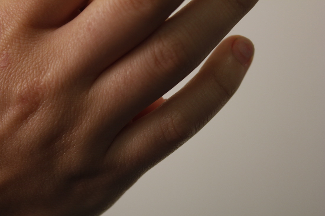
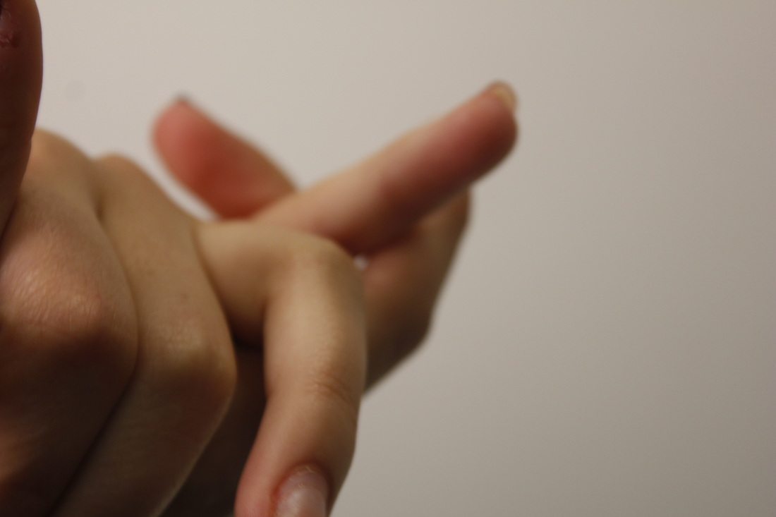
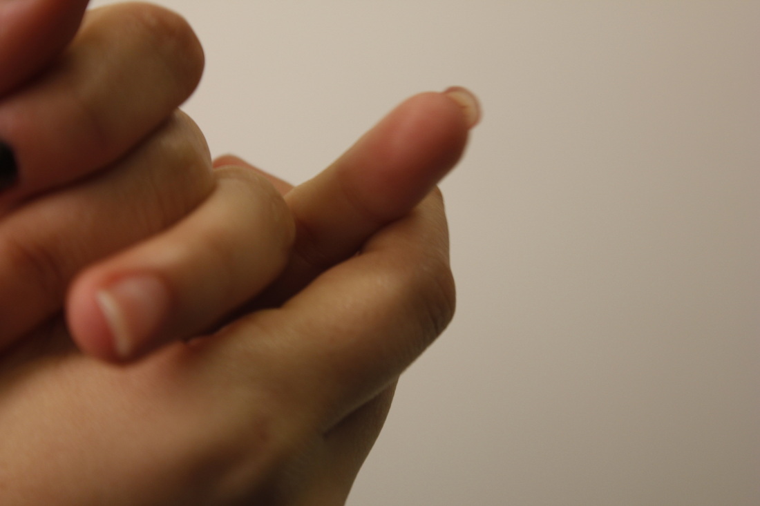
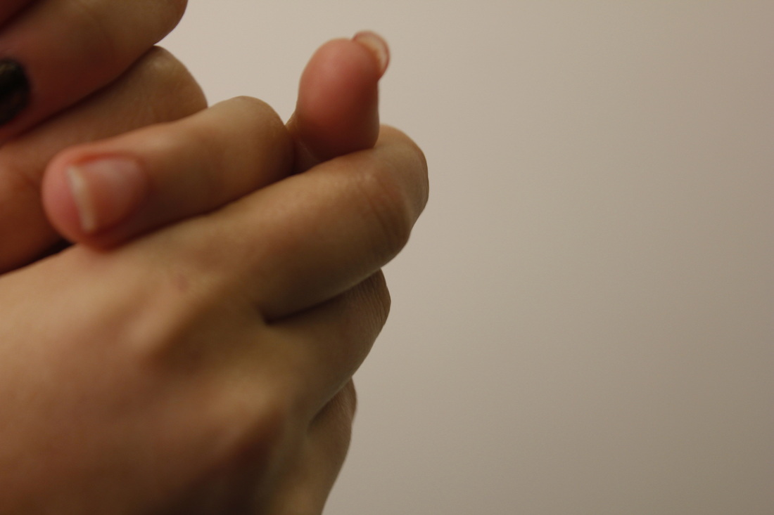
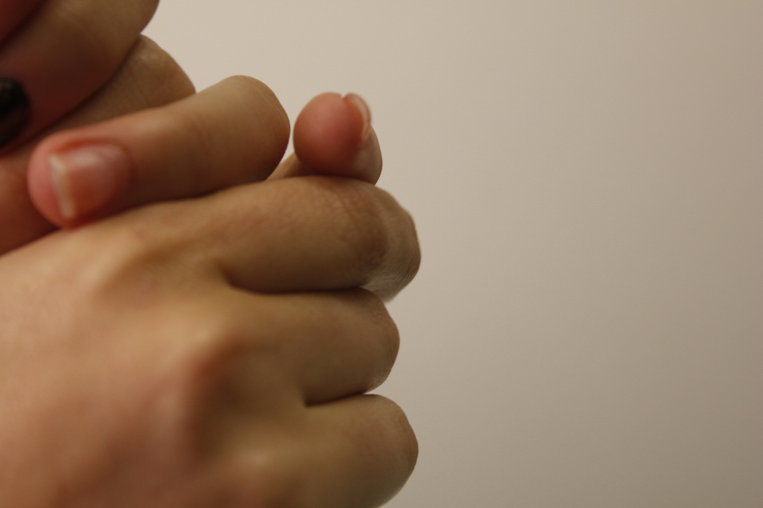
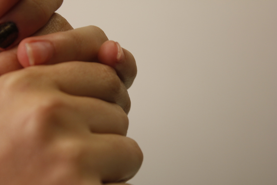
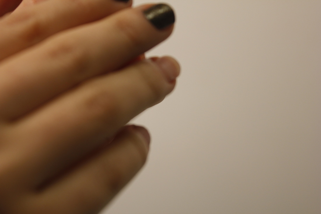
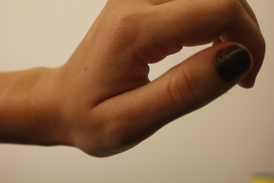
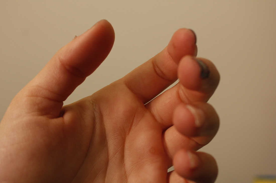
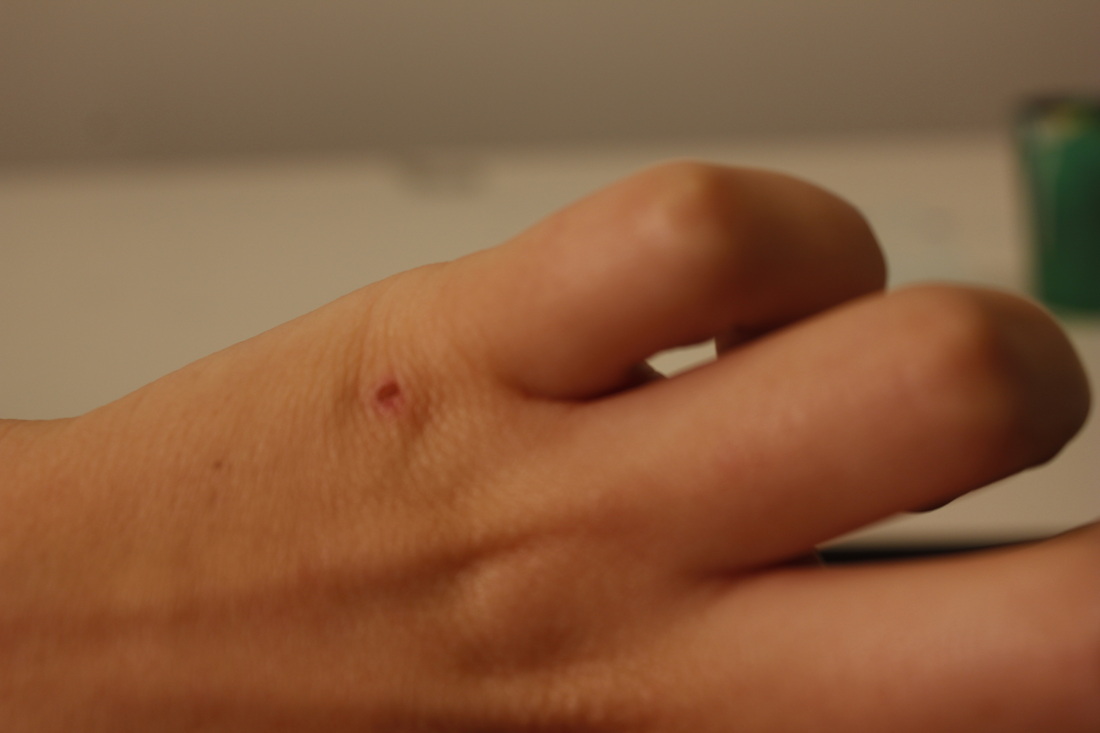
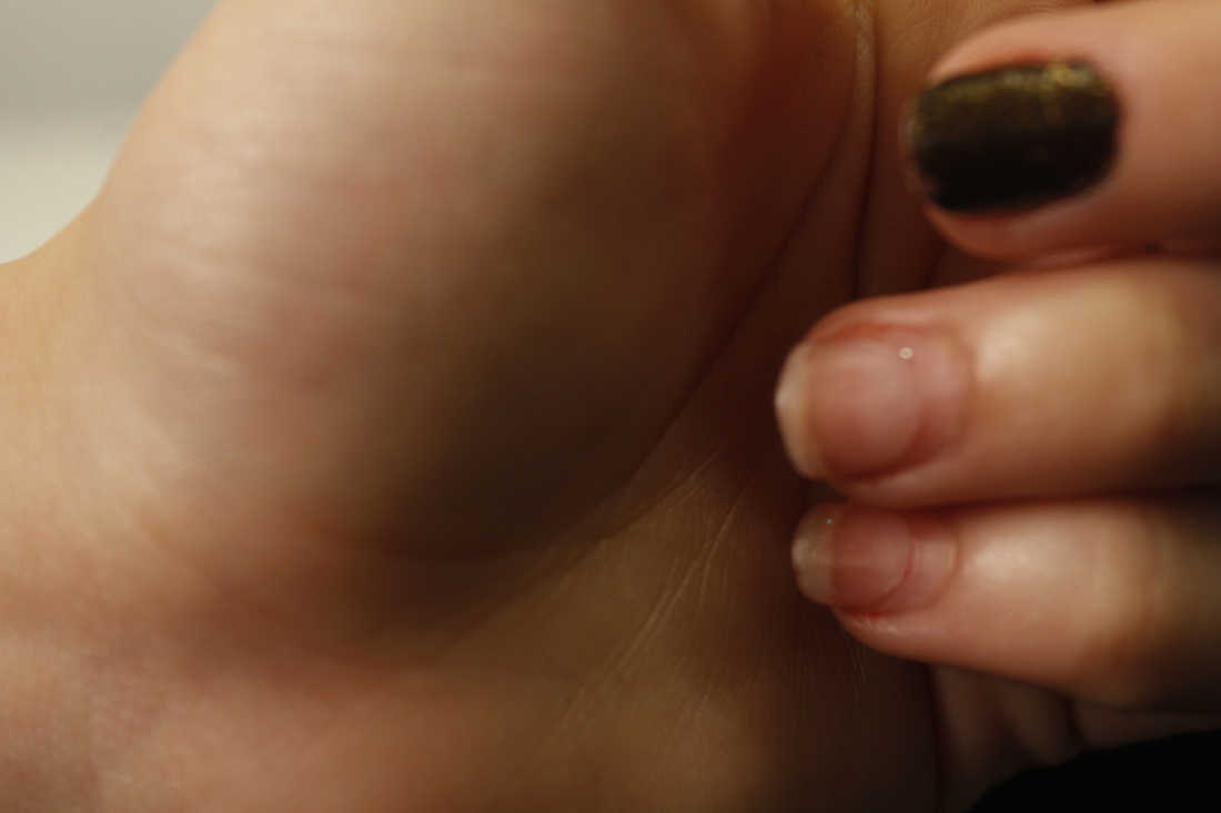
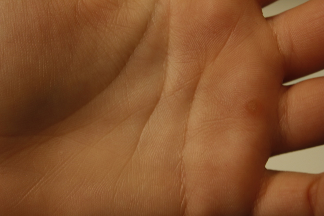
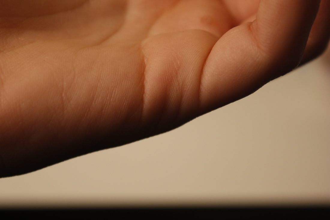
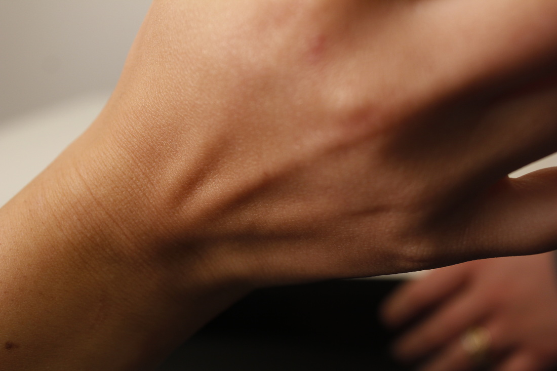
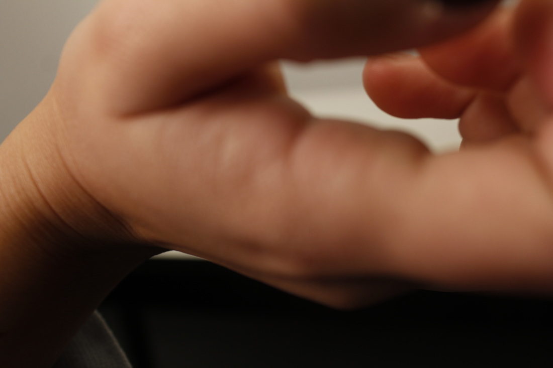
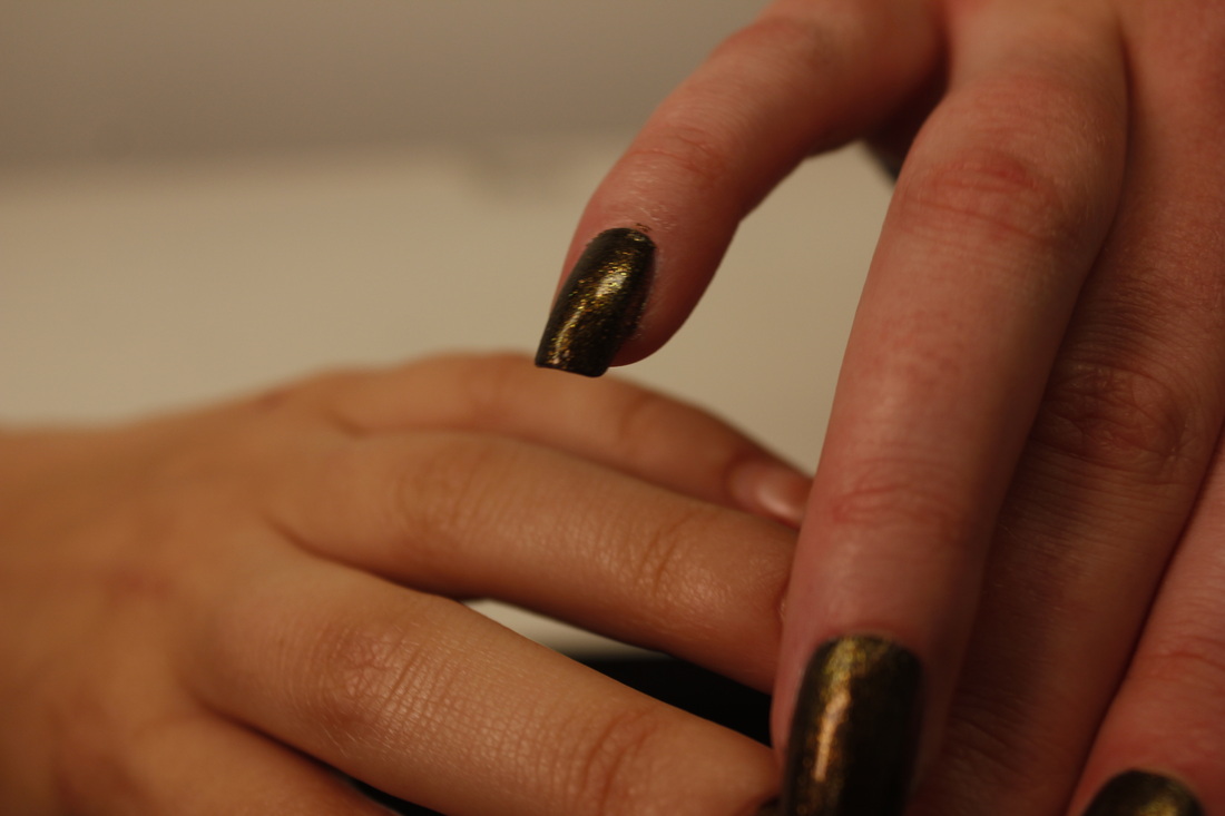
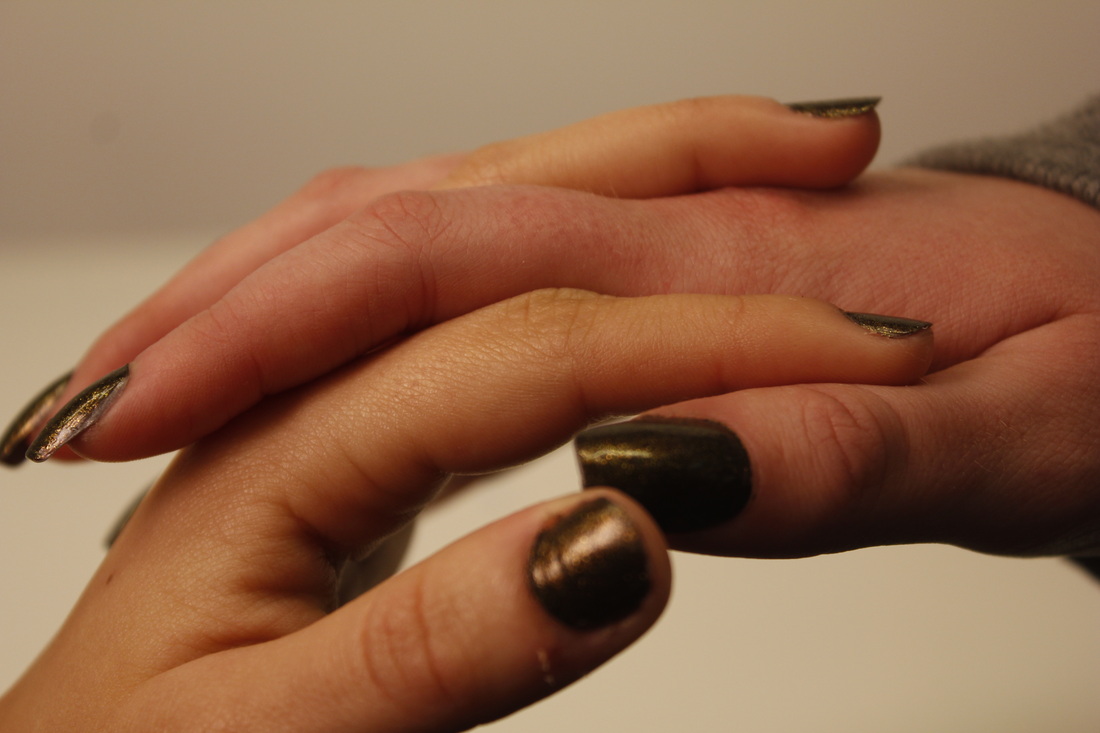
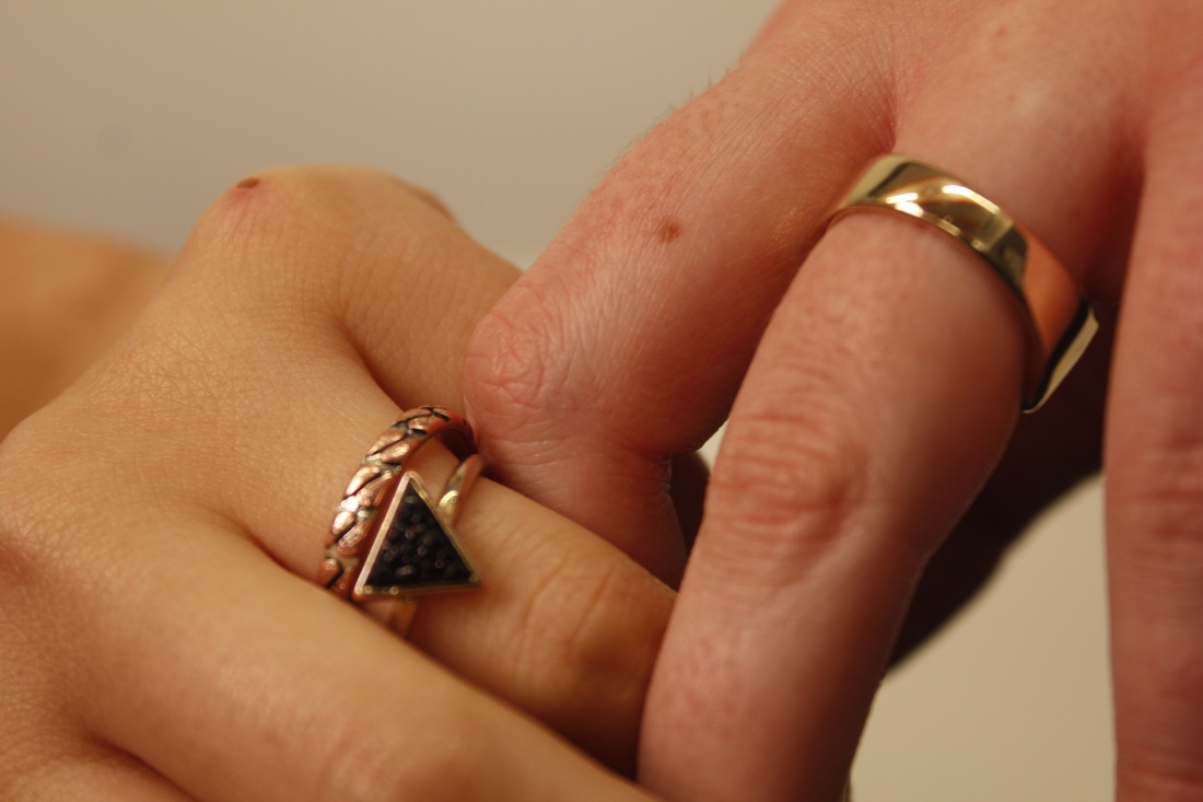
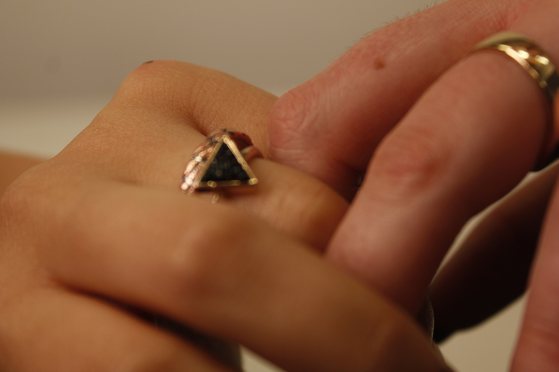
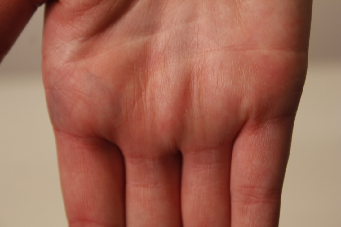
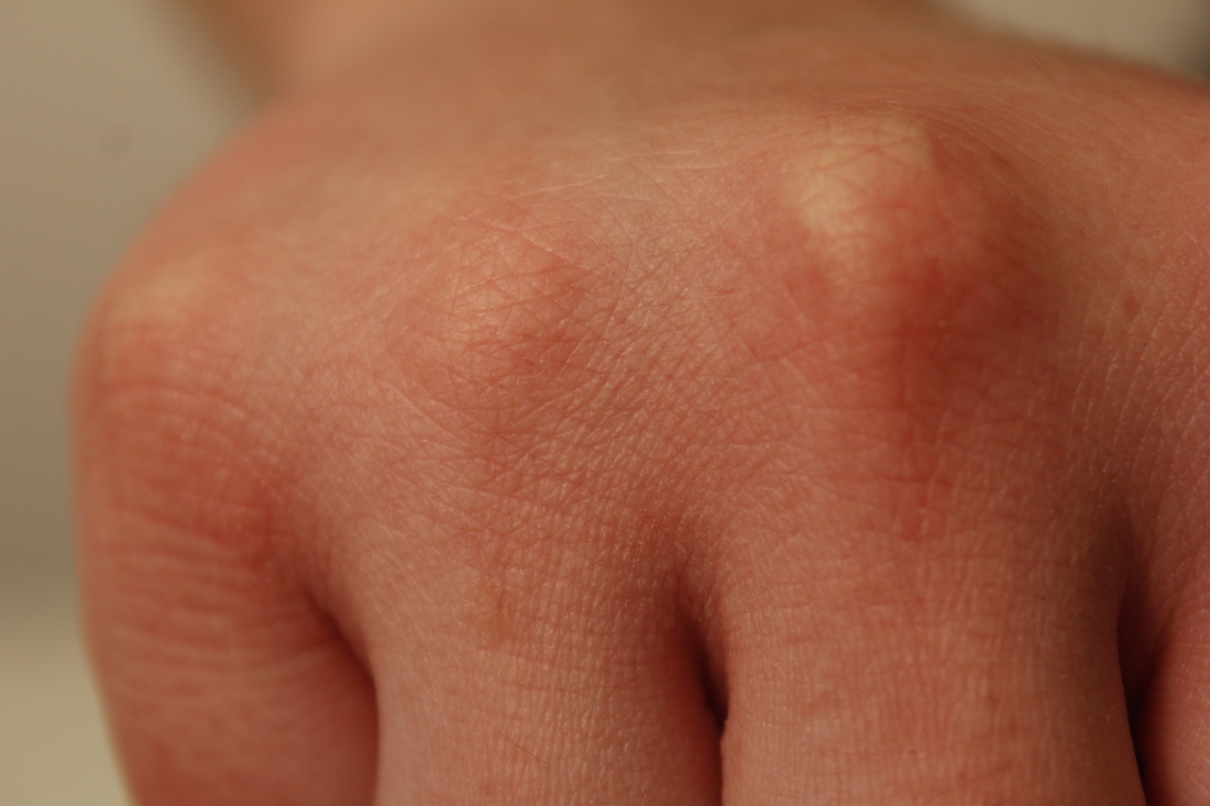
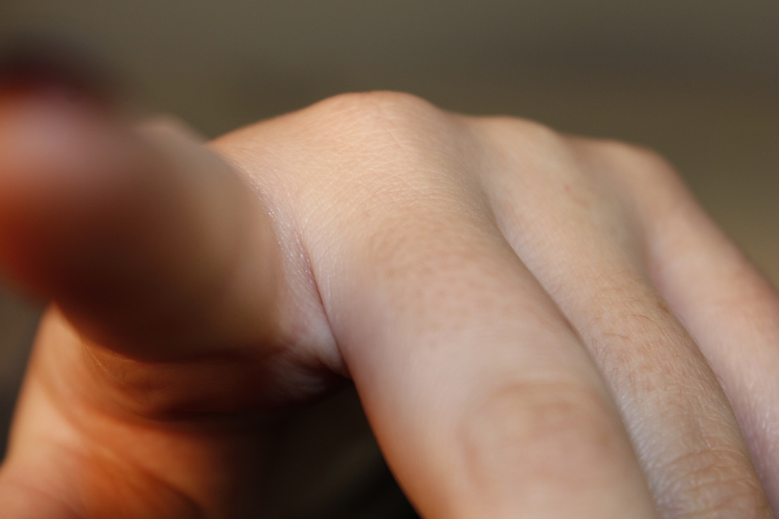
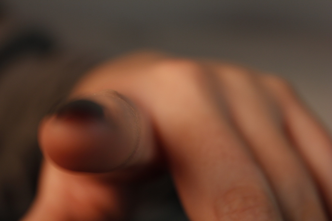
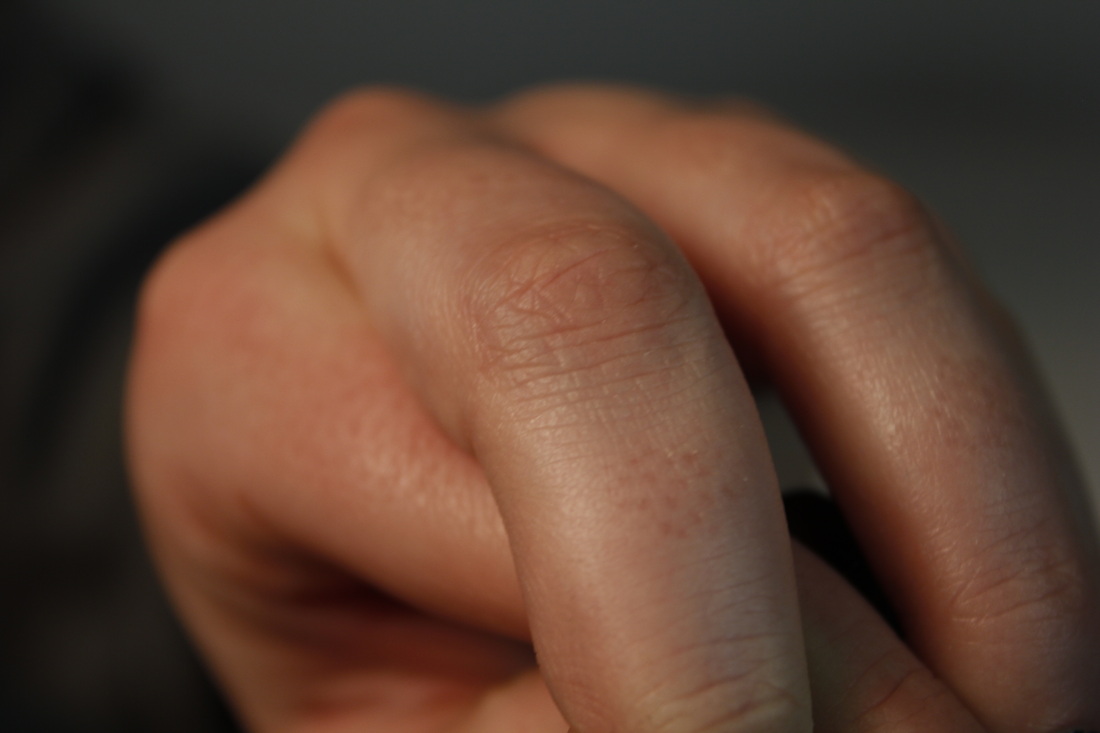
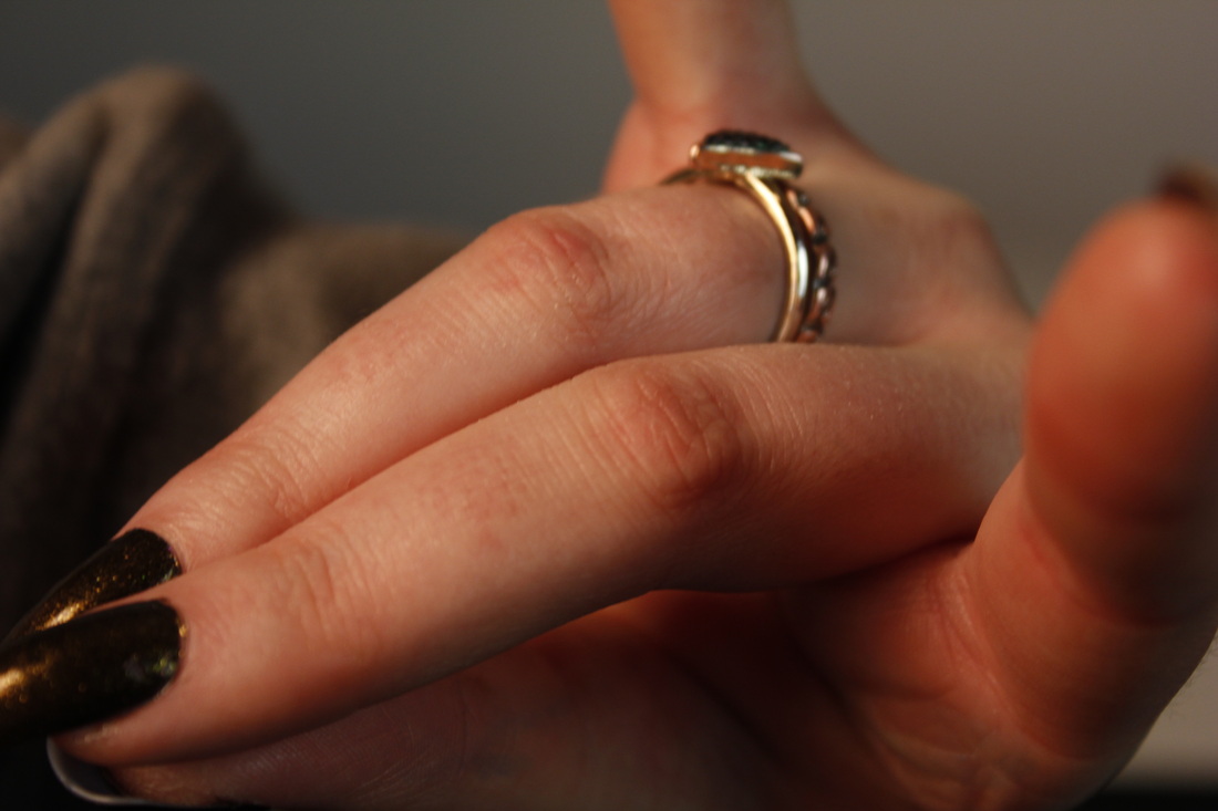
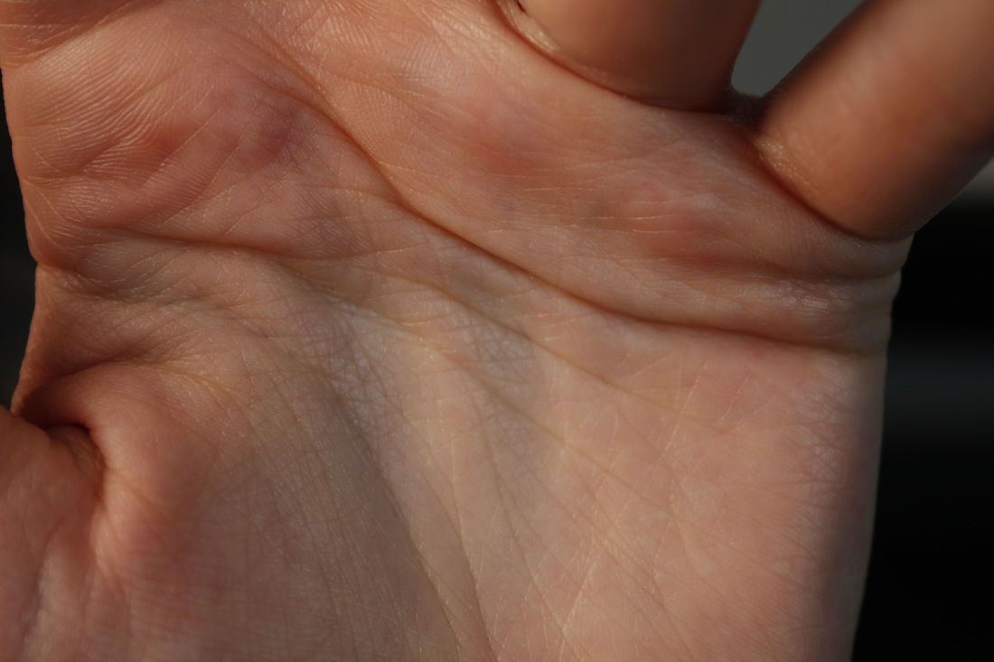
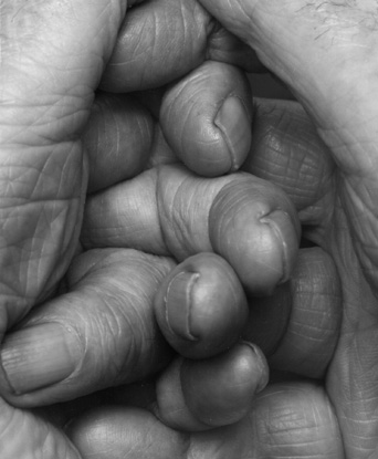
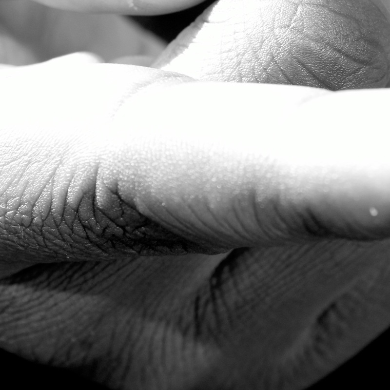
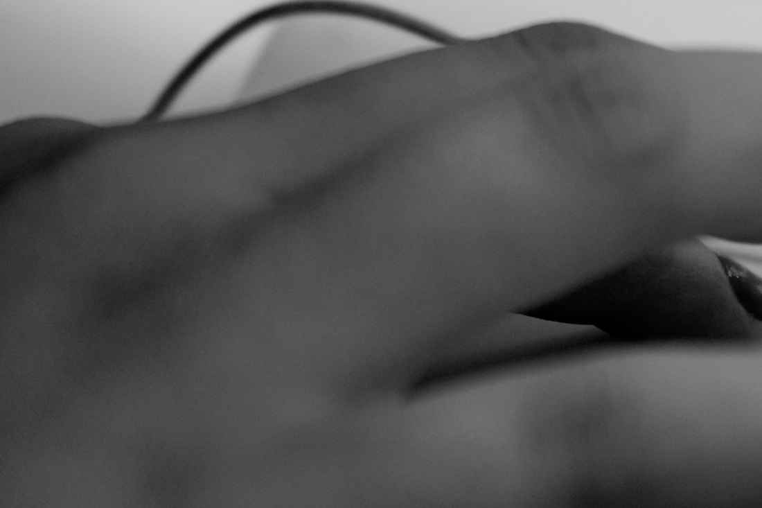
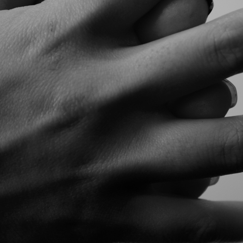
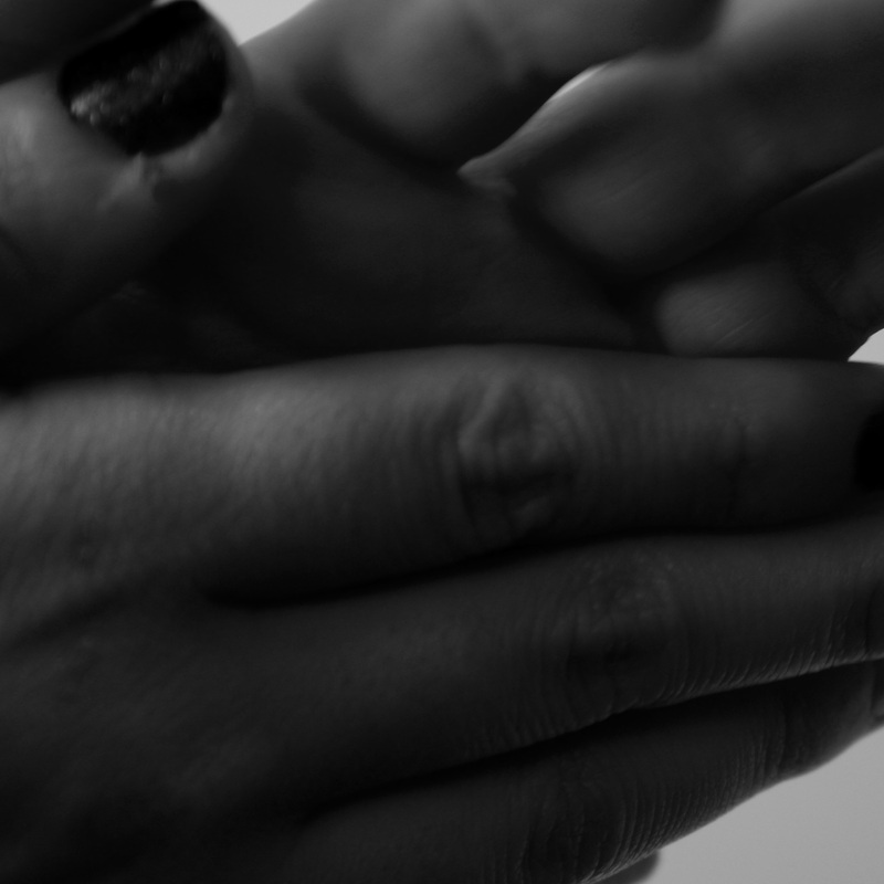
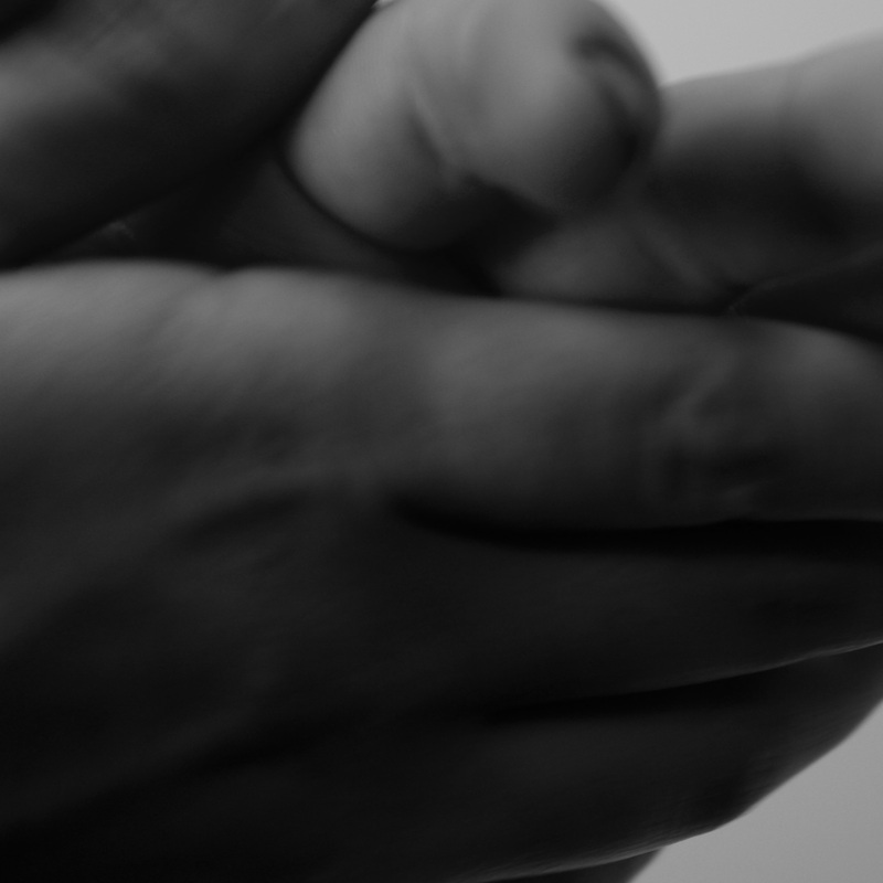
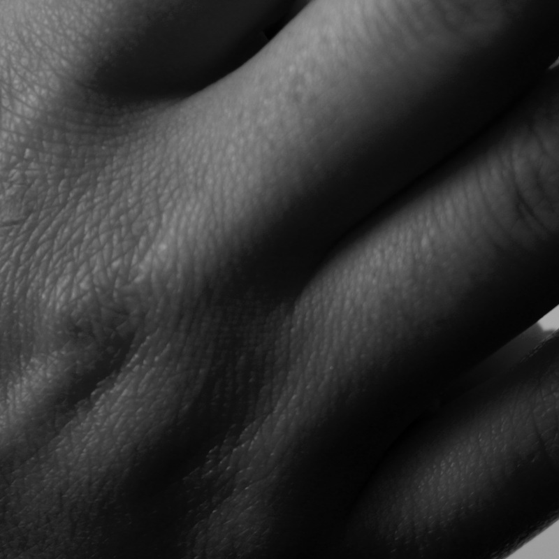
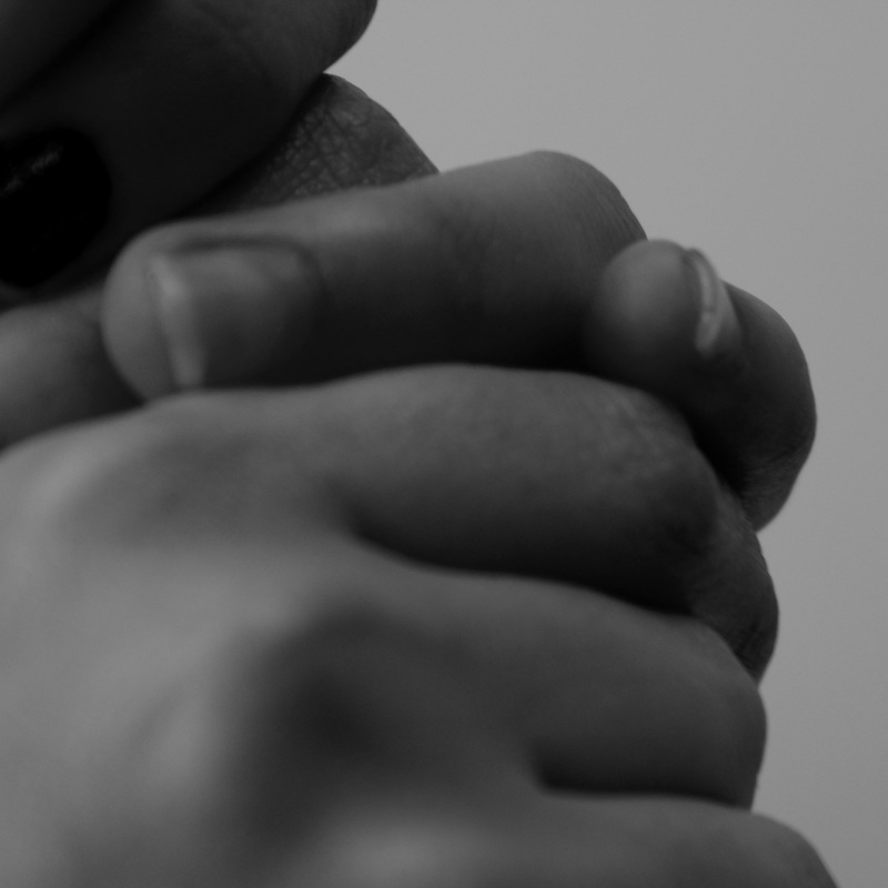
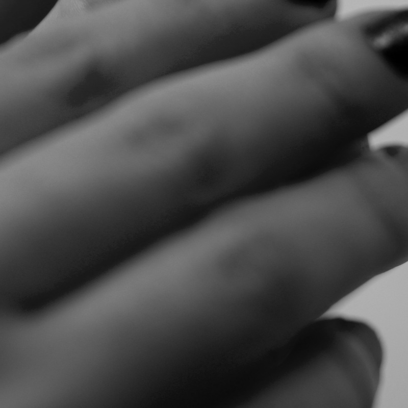
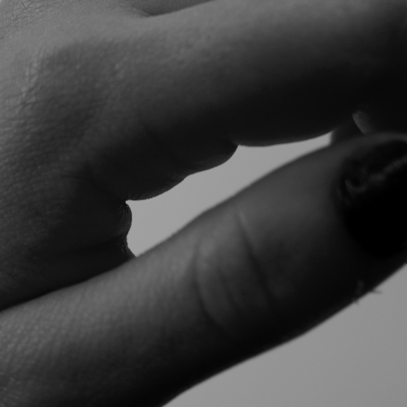
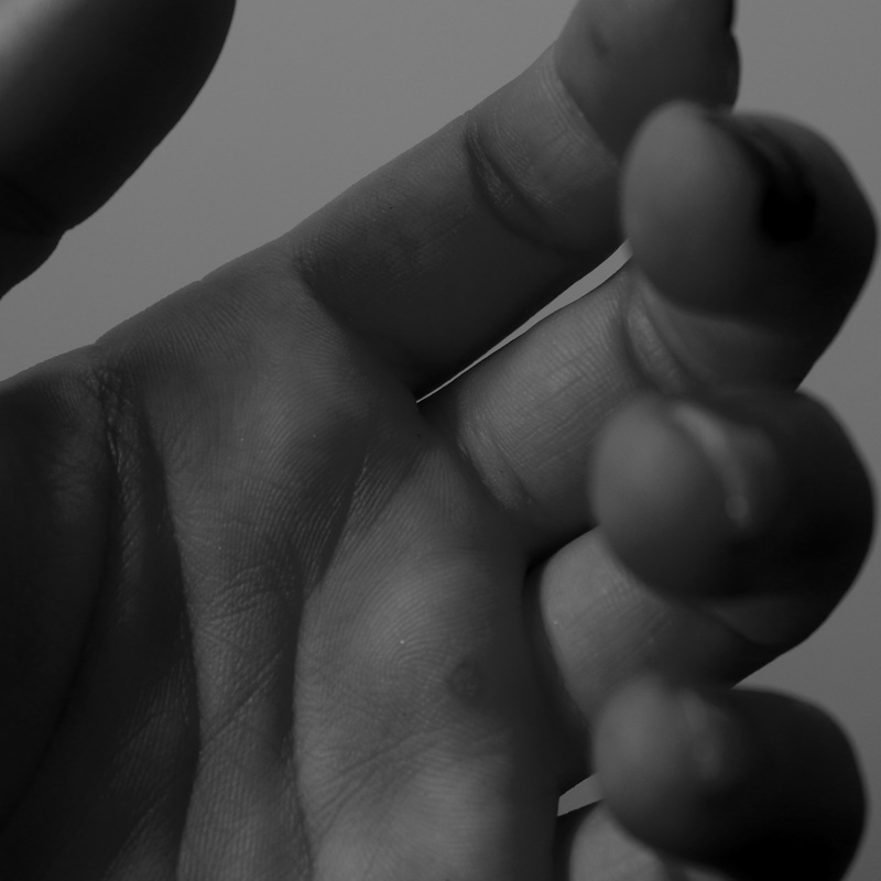
This is the set of hand images that I took in the style of John Coplans and Bill Brandt. Even though all the images are quite similar to each other, I experimented with different shapes, focus and compositions in order to make every image different in its own way. I particularly like the images where the hand takes up the whole of the shot and there is no background space because it makes the hand stand out more and makes you notice all the small details like the creases, lines and prints. After taking these images, I figured that in order to make these images more like those that inspired me, I needed to edit them.
|
To edit the pictures, I used the iPhoto programme on the laptop and used many of the different features. With each image, I first of all cropped them square because of the fact that a square is generally a more abstract shape. A rectangle can either go portrait or landscape whereas a square has no particular form it must follow. I then made the images black and white as I think that that is the effect most commonly used in photography that relates to the body. I then either used the lighten or darken feature, depending on the image and its format. I also used the contrast to highlight the difference between the tones in each image. The last thing I did was I played around with the saturation to outline the intensity of the images.
|
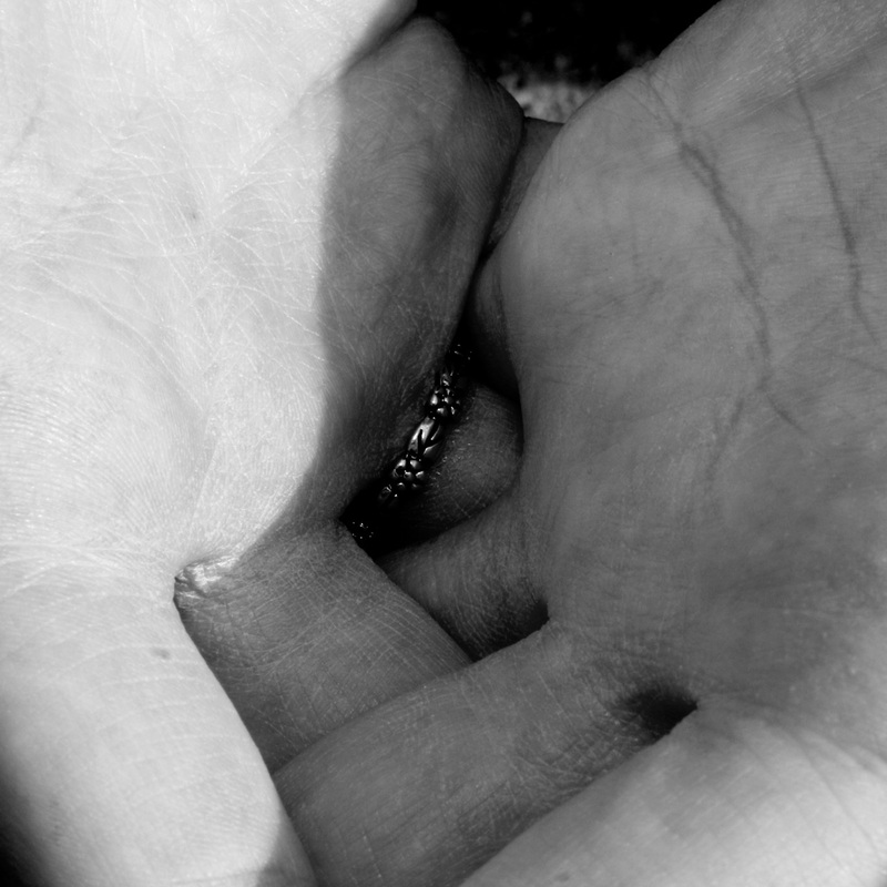
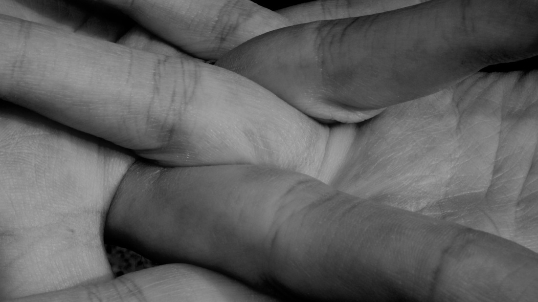
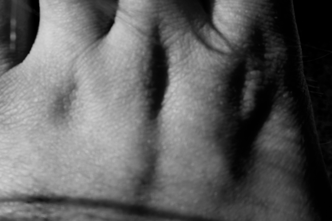


These images are the result of all that I did in iPhoto. I am very happy with how all of these images turned out because I think they really convey the message of abstraction and they have followed the style of Bill Brandt and John Coplans but in their own way. As my final piece, I decided to pick out eight of the images that I thought were the best and then stick them down onto a board in order to display my abstract ideas but not overload viewers with all the images.
Sutcliffe Park |
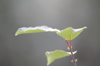
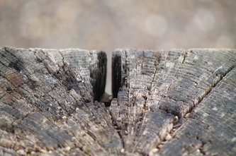
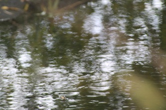
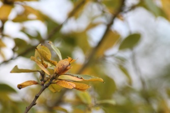
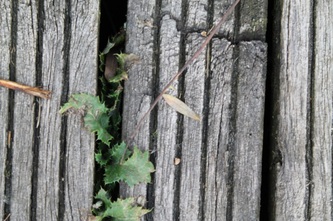
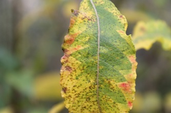
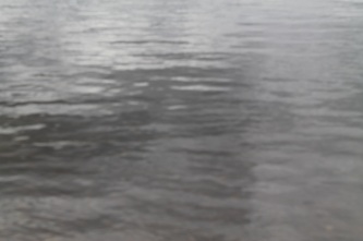
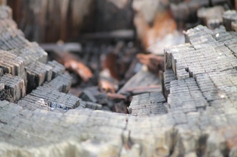
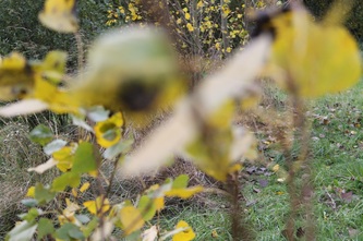
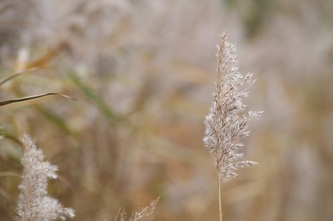
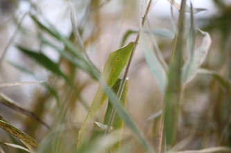
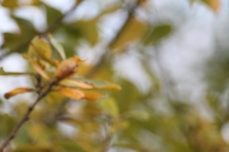
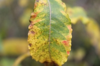
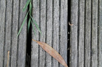
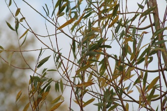
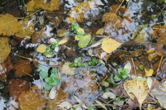
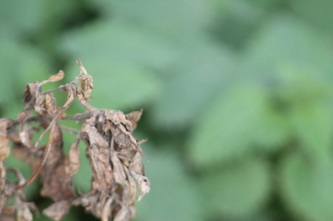
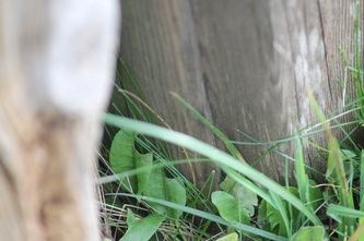
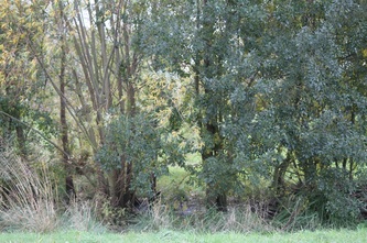
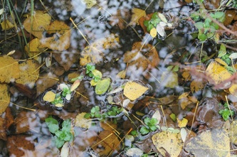
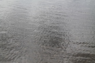
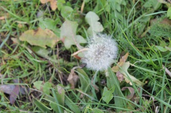
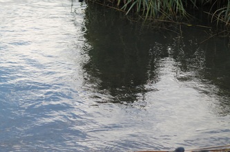
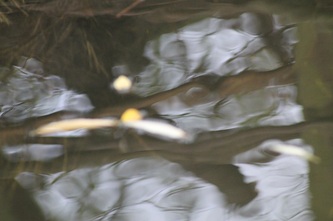
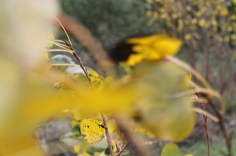
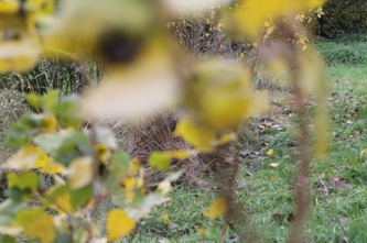
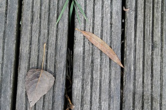
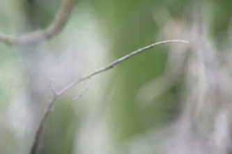
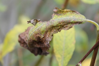
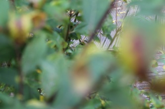
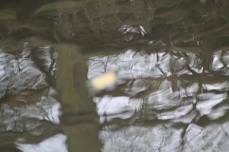
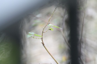
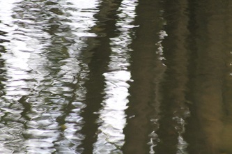
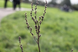
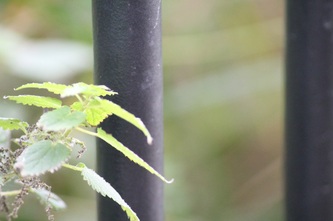
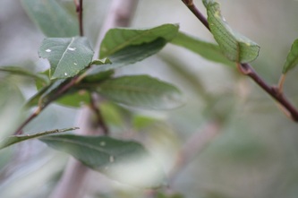
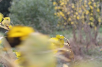
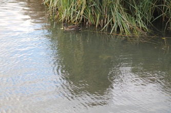
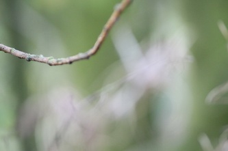
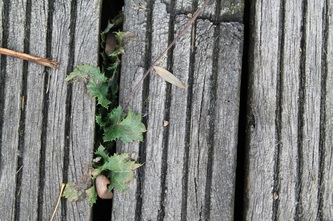
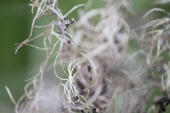
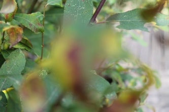
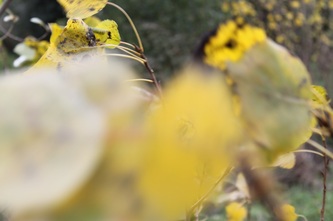
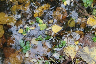
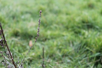
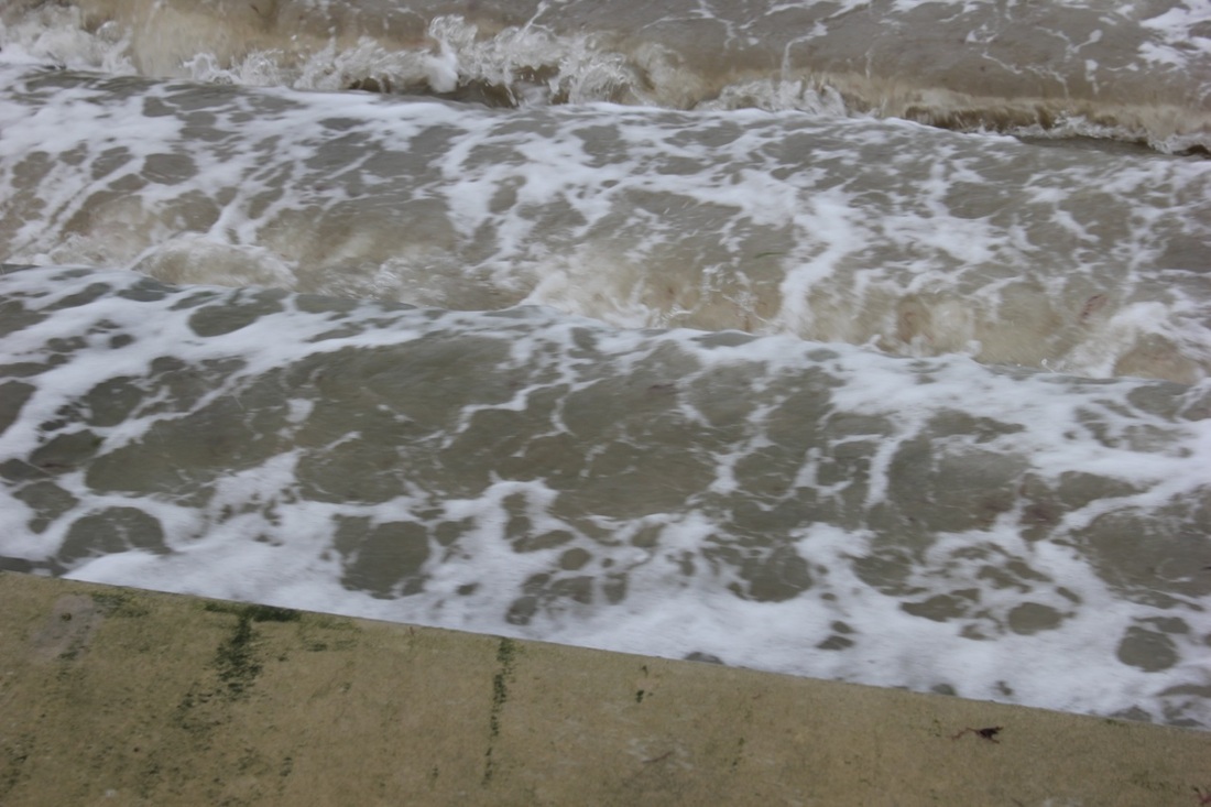
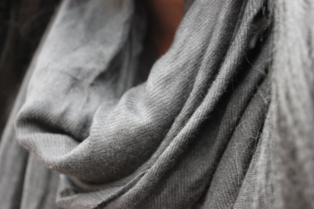
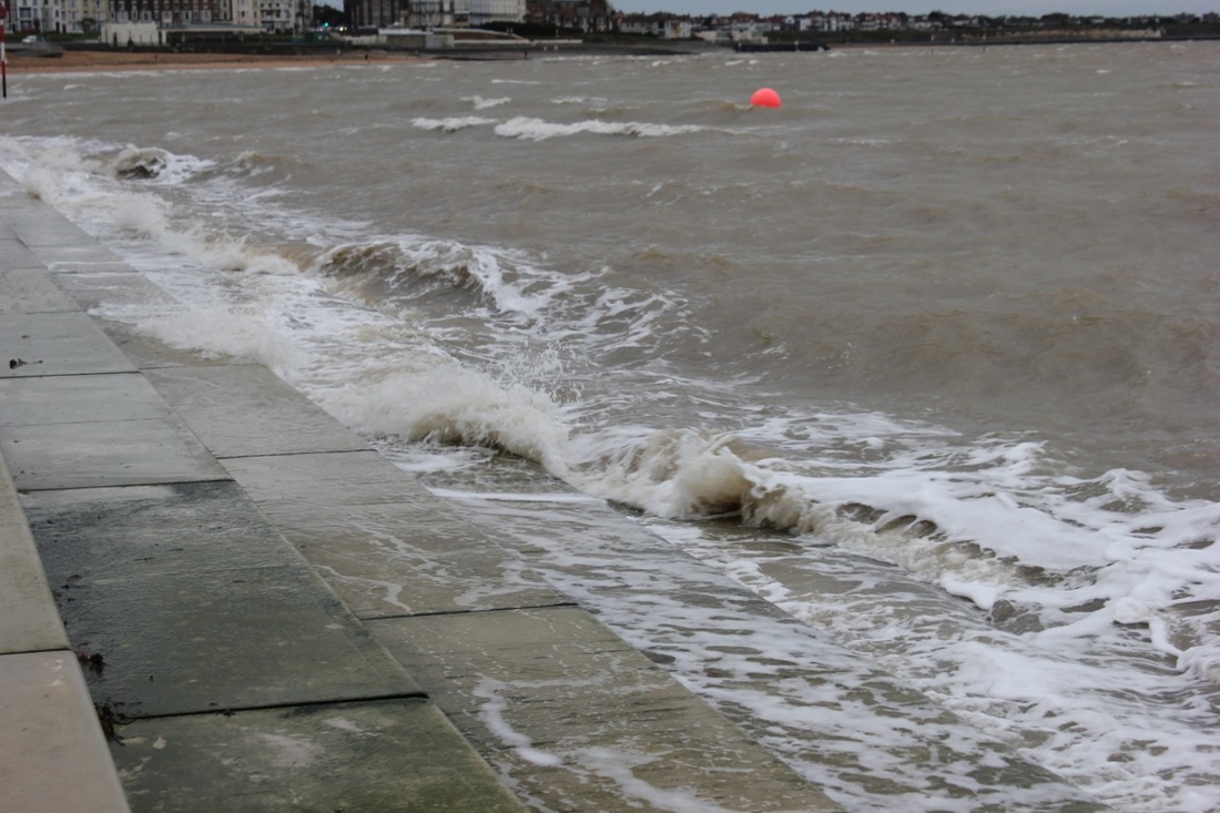
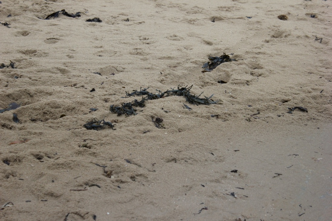
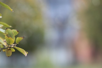
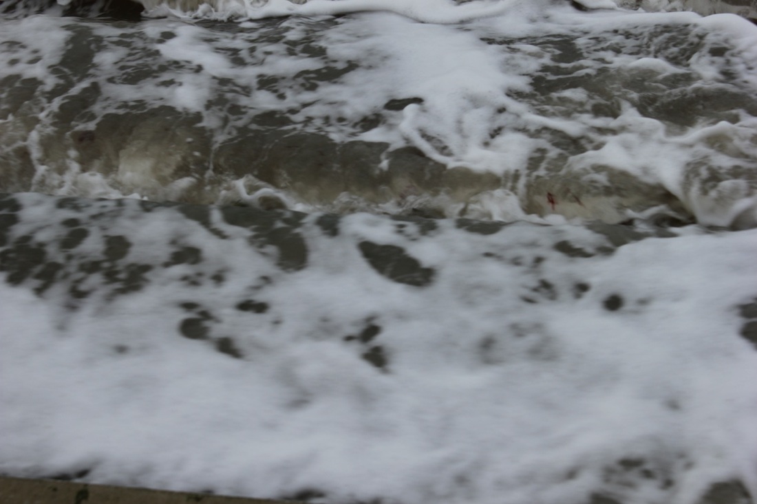
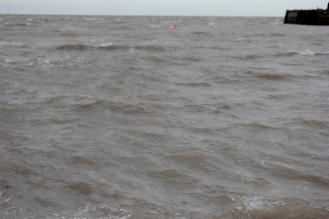
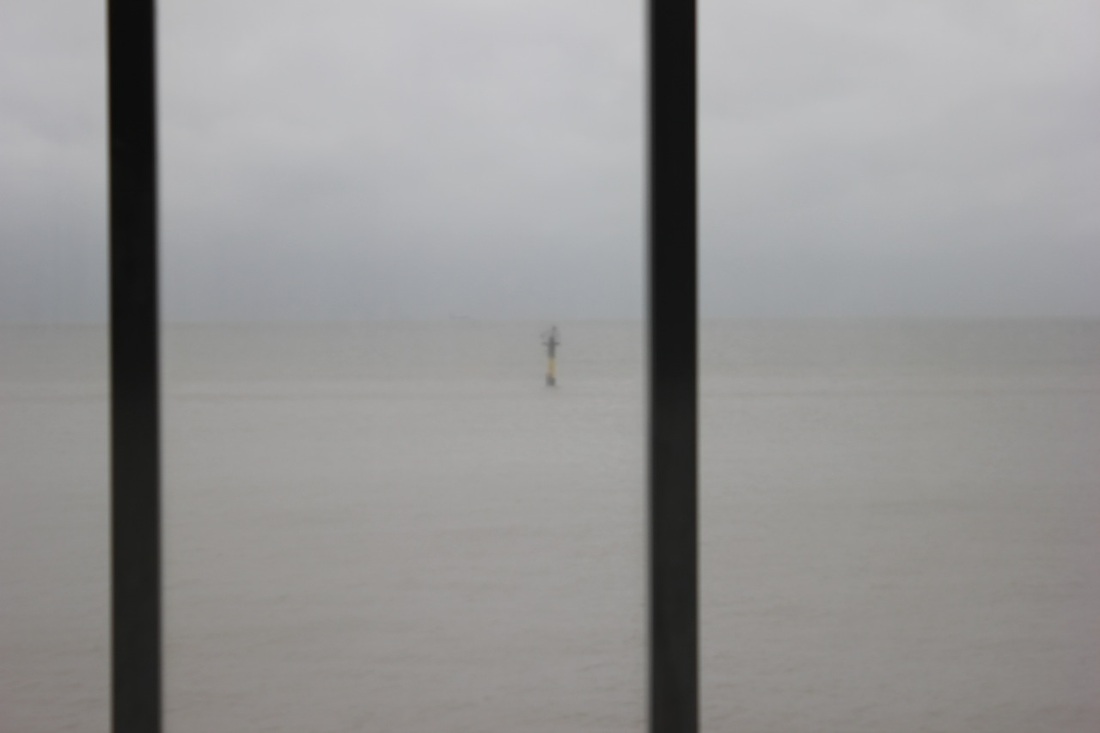
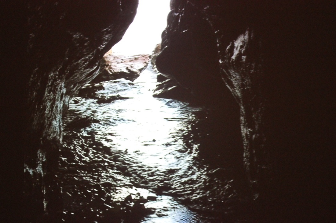
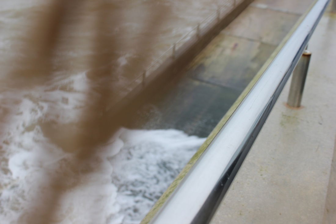
MargateAs part of the abstraction unit, the whole of 11D went out on two journeys.The first one was to Sutcliffe Park which was just down the road from where the school is based. The goal of the outing was to take a set of abstract images to fit with the theme of our personal project. Whilst we were there we worked with the nature around us to create some abstract images. One of the things I experimented with was the focus. I took a few images focusing on one small thing in particular and making everything else behind it quite blurred so the subject of the image stood out more. I also took a few images of the water running through the park. The reason for this was because I think that water in itself is already quite abstract as it is always changing. I think that the water images worked because I was able to see the reflection of the trees in the water but not exactly as it appeared in reality. The trees were in a sort of rippled formation because of the wind that was blowing the water, causing the reflection to change. I think that as a whole, the Sutcliffe Park trip was quite a success as I managed to take a number of images that I think fit in well with the abstraction unit.
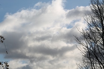
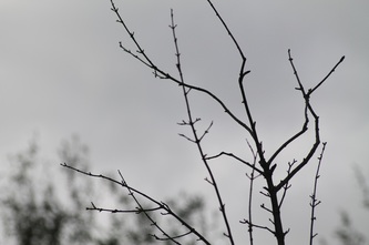
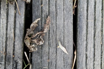
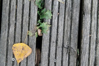
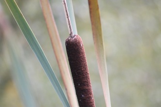
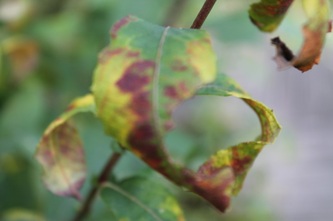
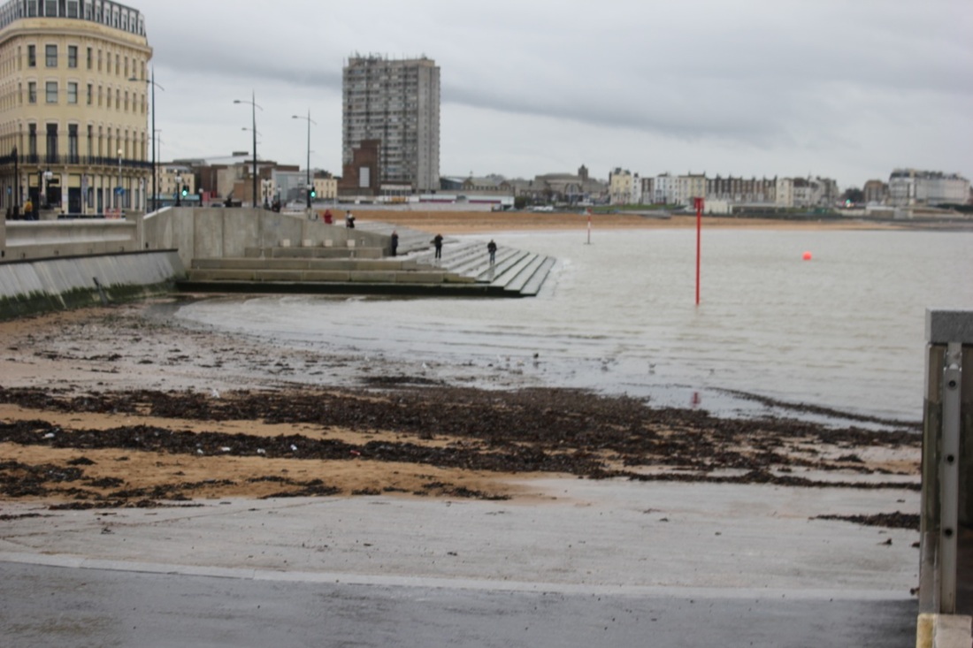
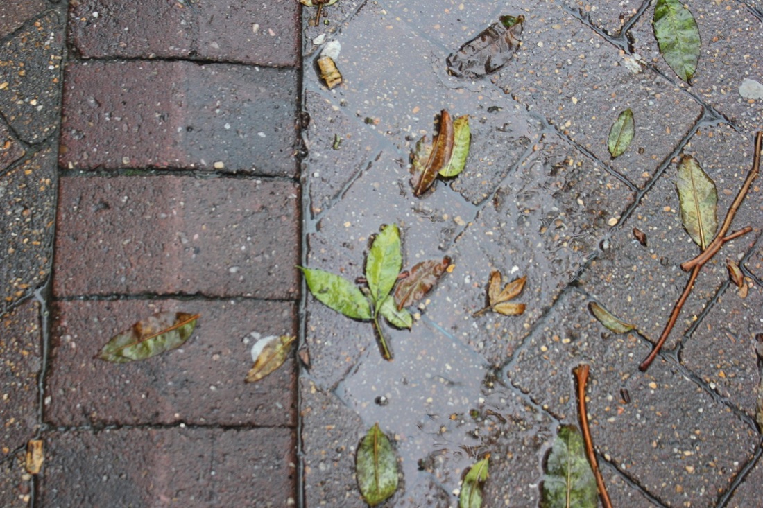
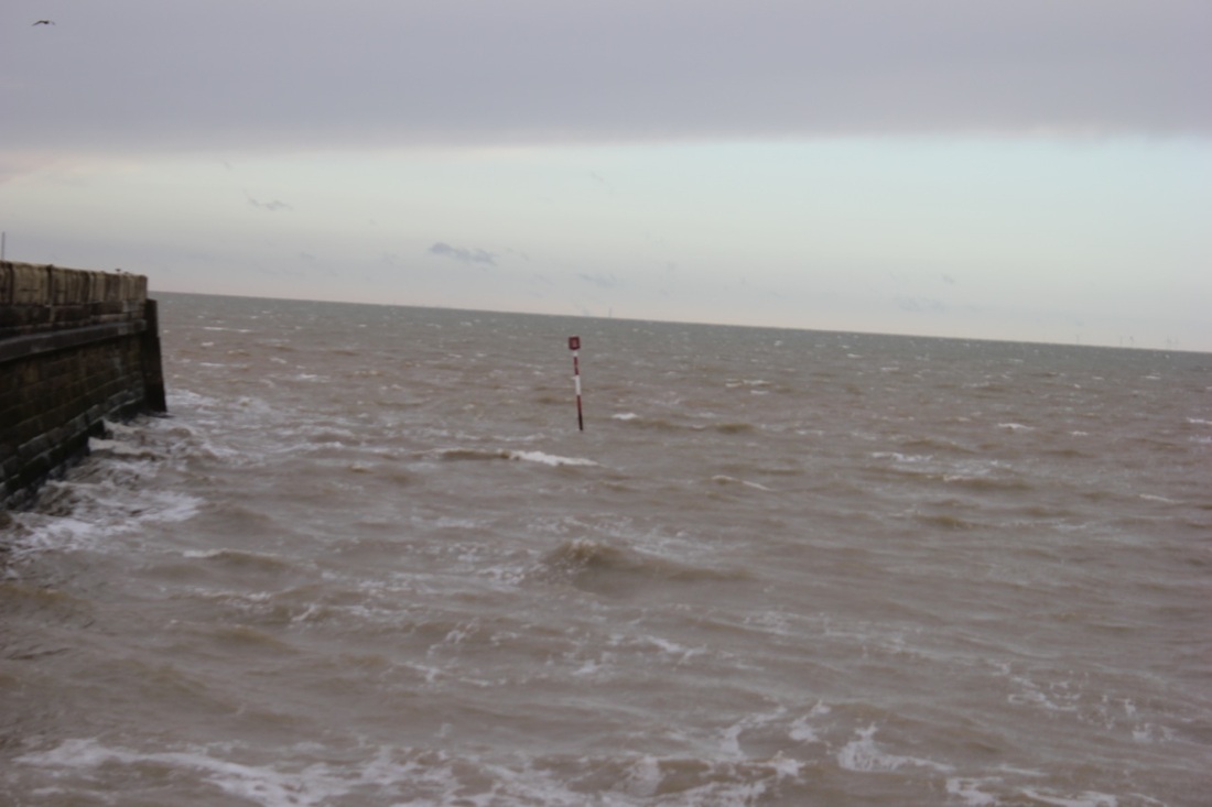
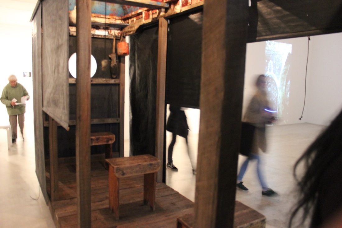
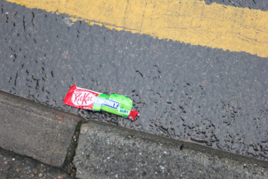
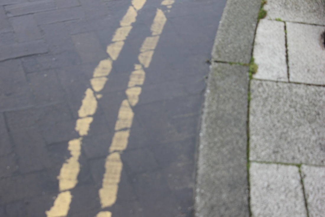
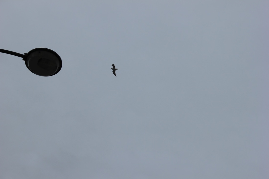
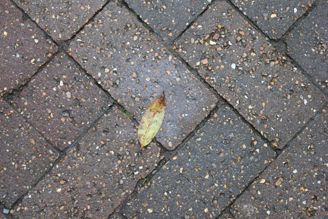
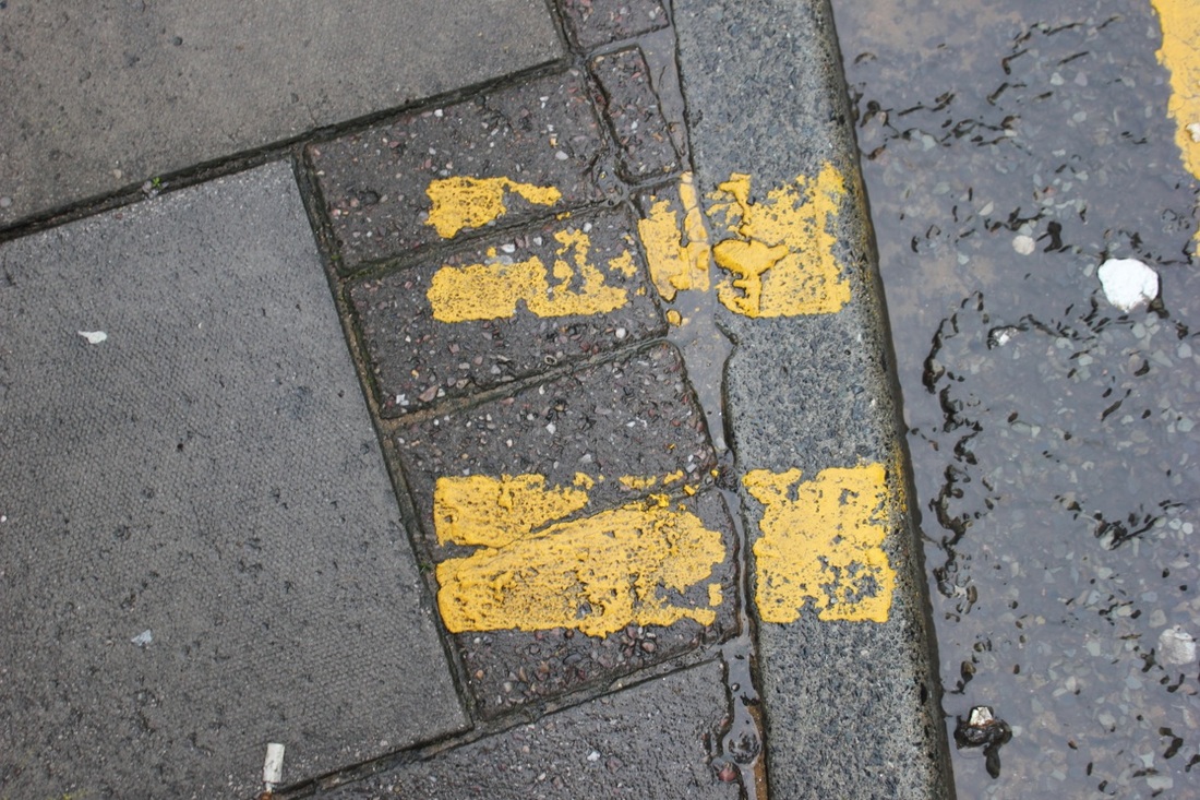
The next trip that we went on the following week was much further away: to Margate. Much like the trip to Sutcliffe Park, the goal again was to take a set of abstract images to fit in with the theme. We had the DSLR cameras and also the iPods. The first thing we did when we arrived there was we explored to art gallery that was there; Turner Contemporary. All the pieces in the gallery were all very abstract and so we all took photographs of pieces we found the most interesting in terms of abstraction. After we had finished in the gallery, we all split up to walk around the town. During this time, we took more abstract images, focusing on everything around us. It worked very well because it was mixture of both abstract photography and street photography. I like the images I took because I think the focus a lot on the outside world and how everything around us is abstract in its own weird way. This trip I think was also a success because we got to take more abstract images which weren't just focused on nature like those taken at Sutcliffe Park. |


My Second Final Piece
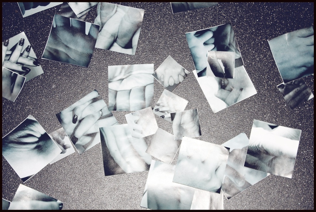
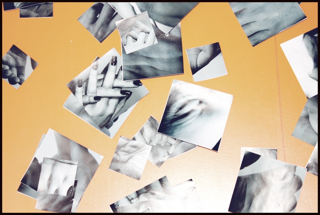
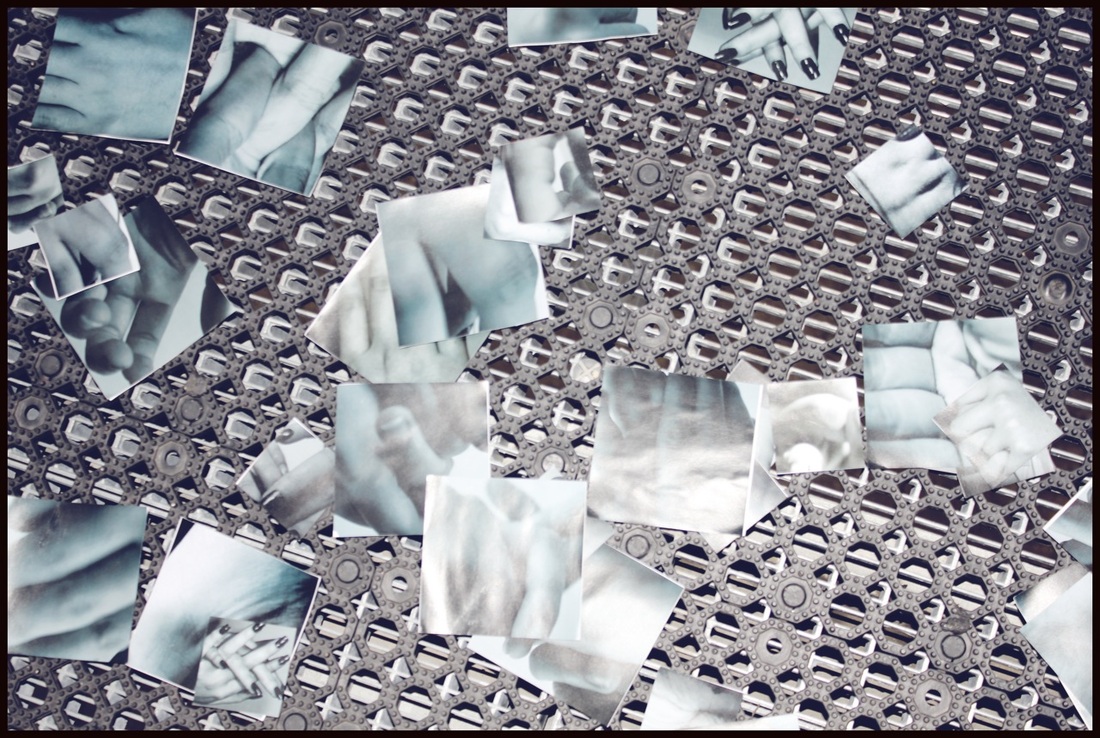
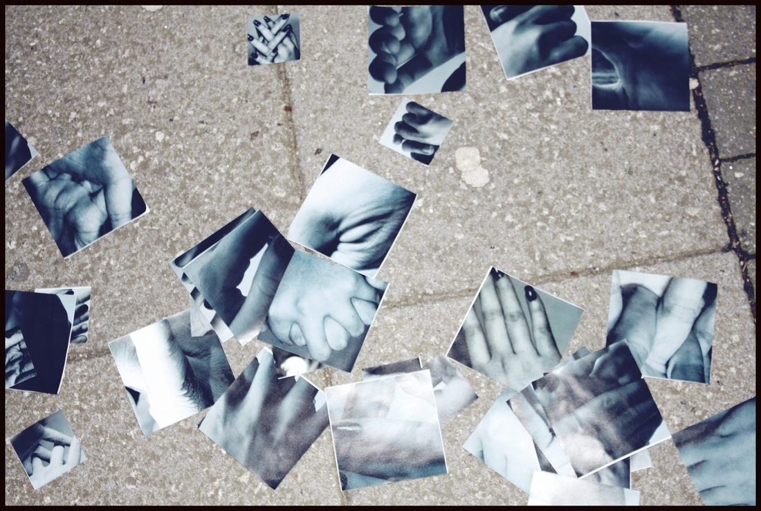
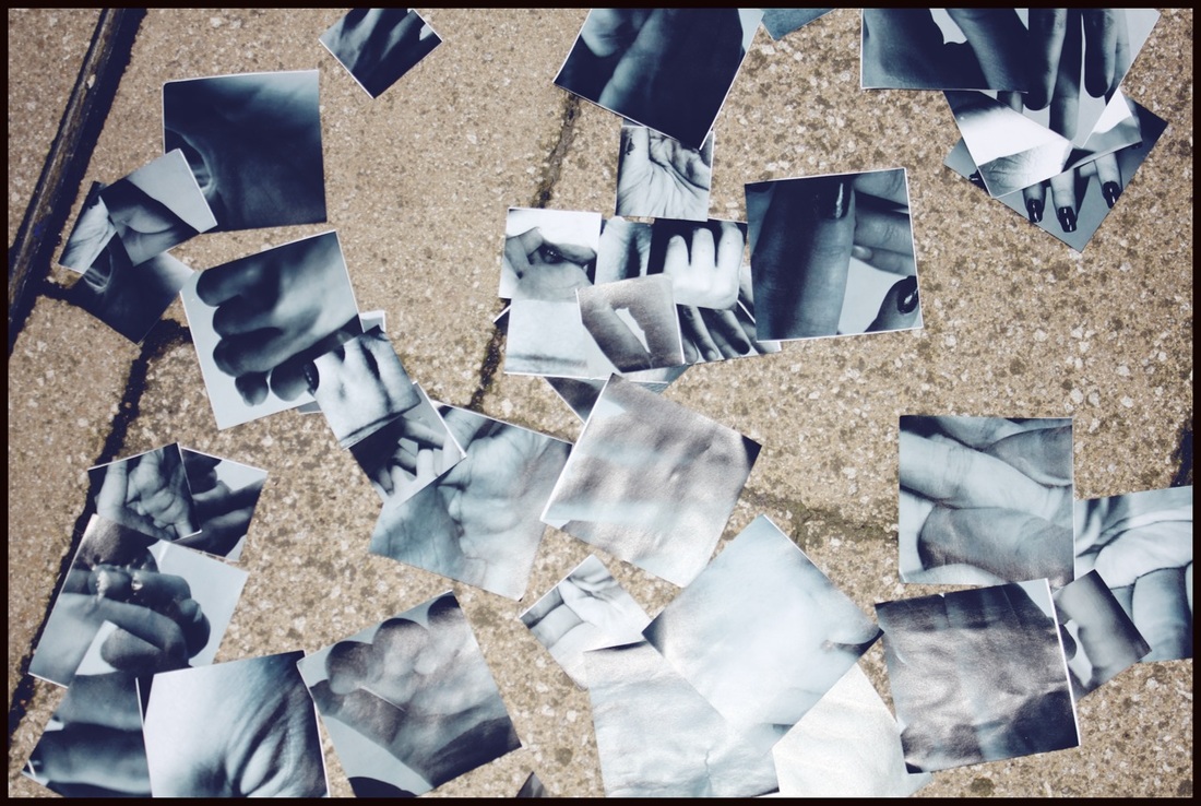
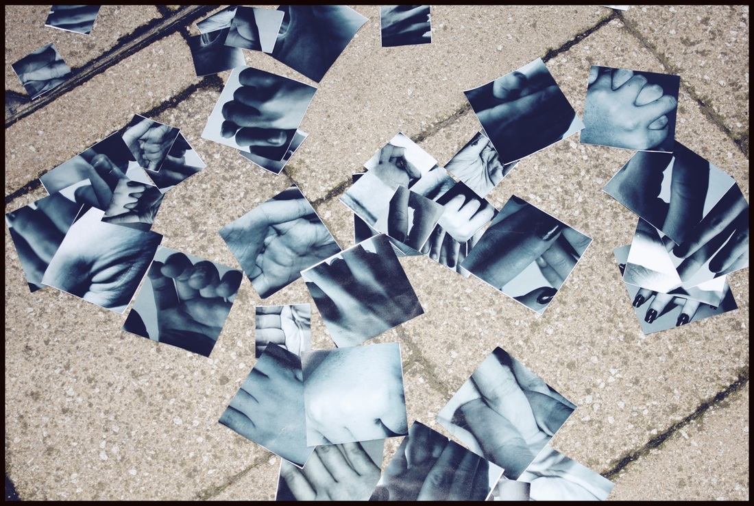
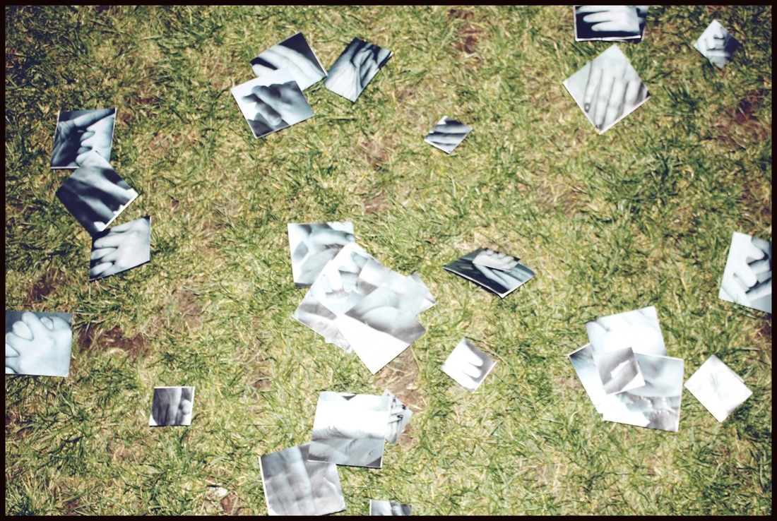
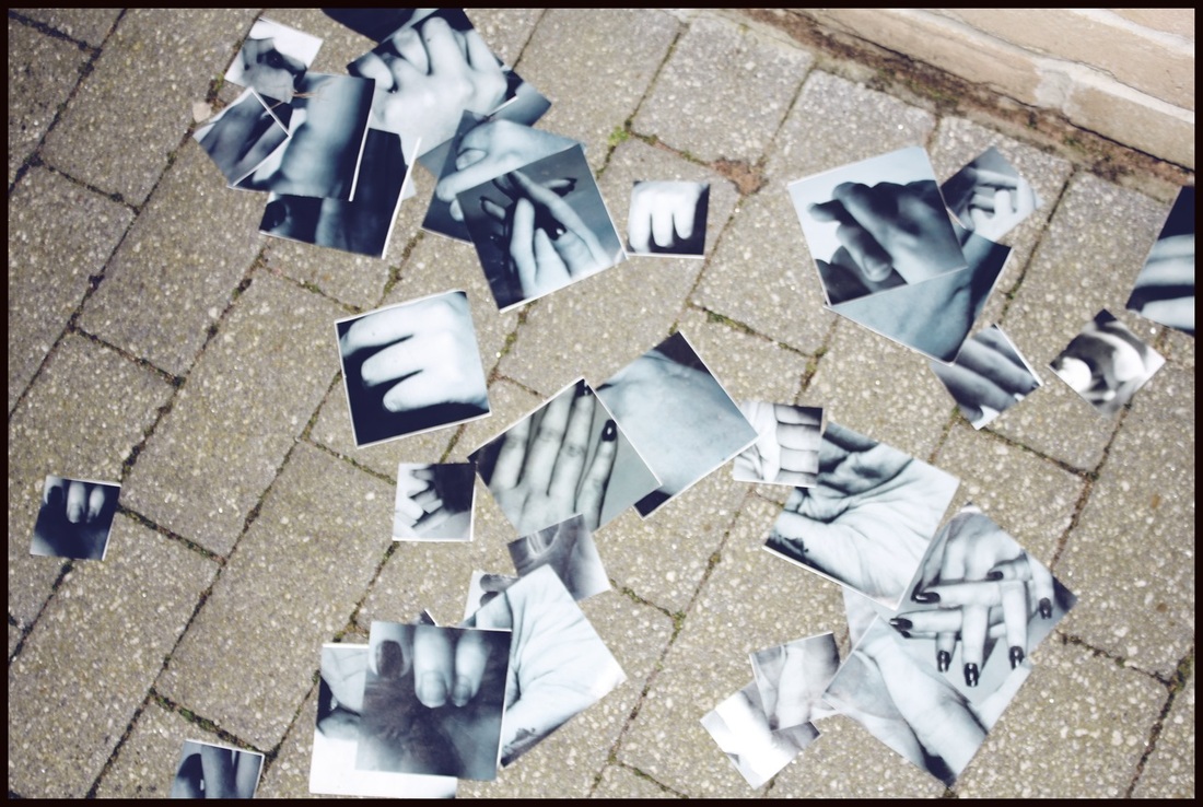
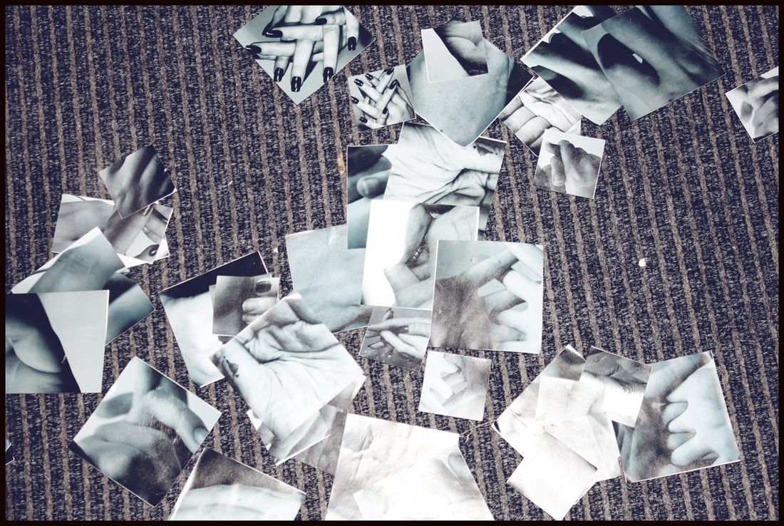
Although I already made a final piece, when looking at it again I decided that although I was quite content with how it turned out, it wasn't the outcome I wanted for my hand images; it looked too boring. This brought me to the decision that I was going to create another final piece. My first initial thought was that I created so many images that went to waste with my first final piece - I didn't want this to be the outcome for my next piece. Because of this, I decided to use all of the images in my next final piece. I wasn't quite sure what size images I was going to need for when I eventually made my final piece and so I printed off two different sizes to be more prepared - a big size and a slightly smaller size. It wasn't long after that I figured out what I was going to do. With the help of my teacher, I decided that I was going to stick all the images back to back randomly, both big and small. I was then going to throw the pictures at the ground so that they scattered randomly and then photograph how the images ended up. And so that was what I did. After doing it once, I then repeated the process on different backgrounds so as to make the images more interesting. After taking nine images, I then stuck them all down onto a board and cut around each of the images so they can be displayed any way that I want in the gallery. I am a lot happier with these images than my first final piece, I now feel as though my images have properly served their purpose and have not gone to waste.
